
This personal project is an exercise aimed at developing my skills in UI design on Figma, applying a minimal UX methodology to meet user needs while considering the business side.
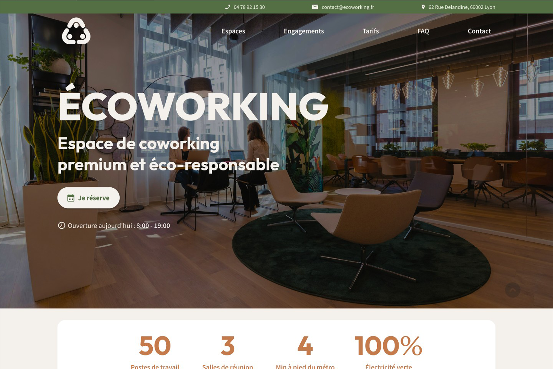
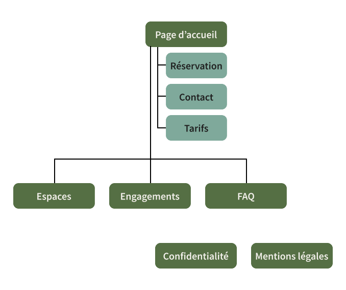
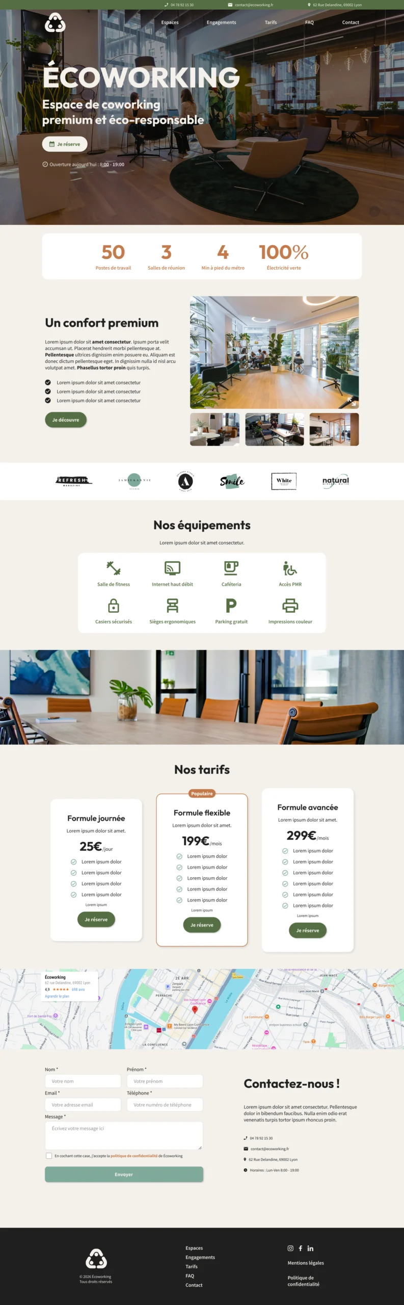
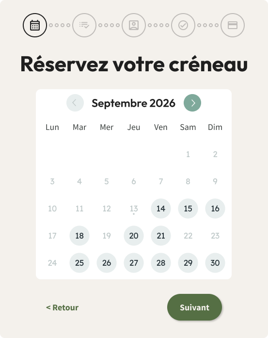
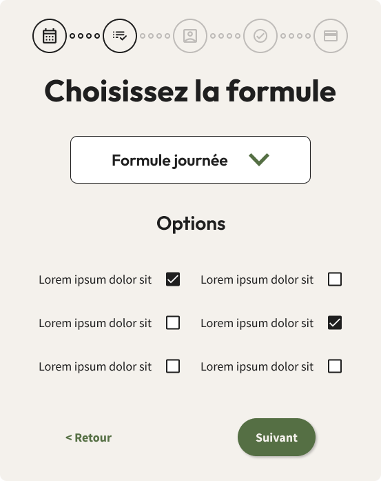
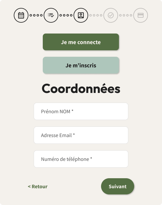
So I chose to design a website for a fictional coworking space, including a conversion-optimised home page/landing page and a booking flow.
For my research phase, I first audited two competing websites:
| Cobalt coworking | Coolworking | |
|---|---|---|
| Strengths 💪 | Clear premium positioning Reassuring, clear and refined |
Promotion of services and packages Structured and optimised home page |
| Weaknesses 👎 | No true booking system Limited and unengaging CTAs Eco-responsibility not very visible in the graphic charter |
Booking process not very intuitive CTAs that are not visually well organised Too much text |
I then conducted a short user interview combined with online research to list common pain points:
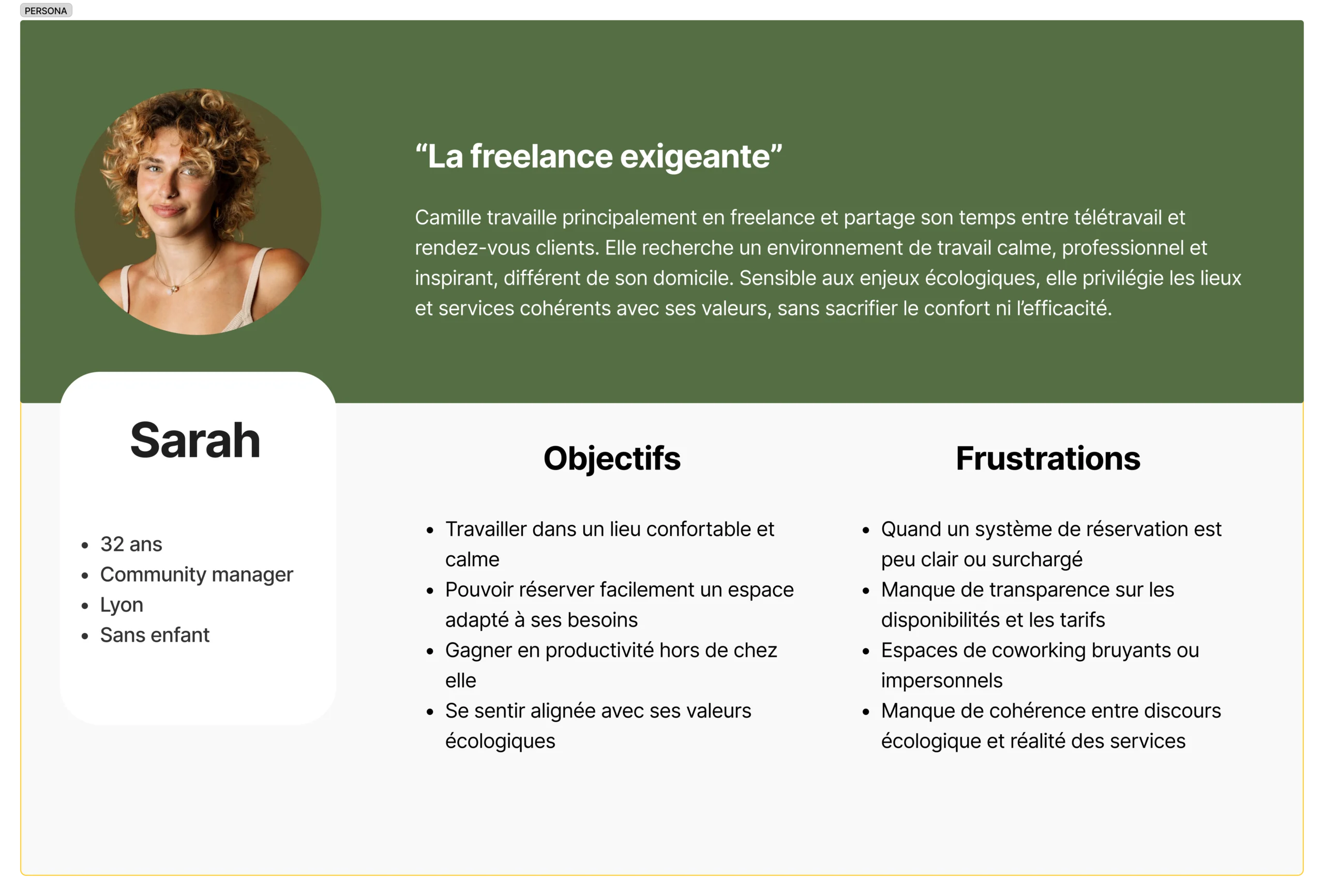
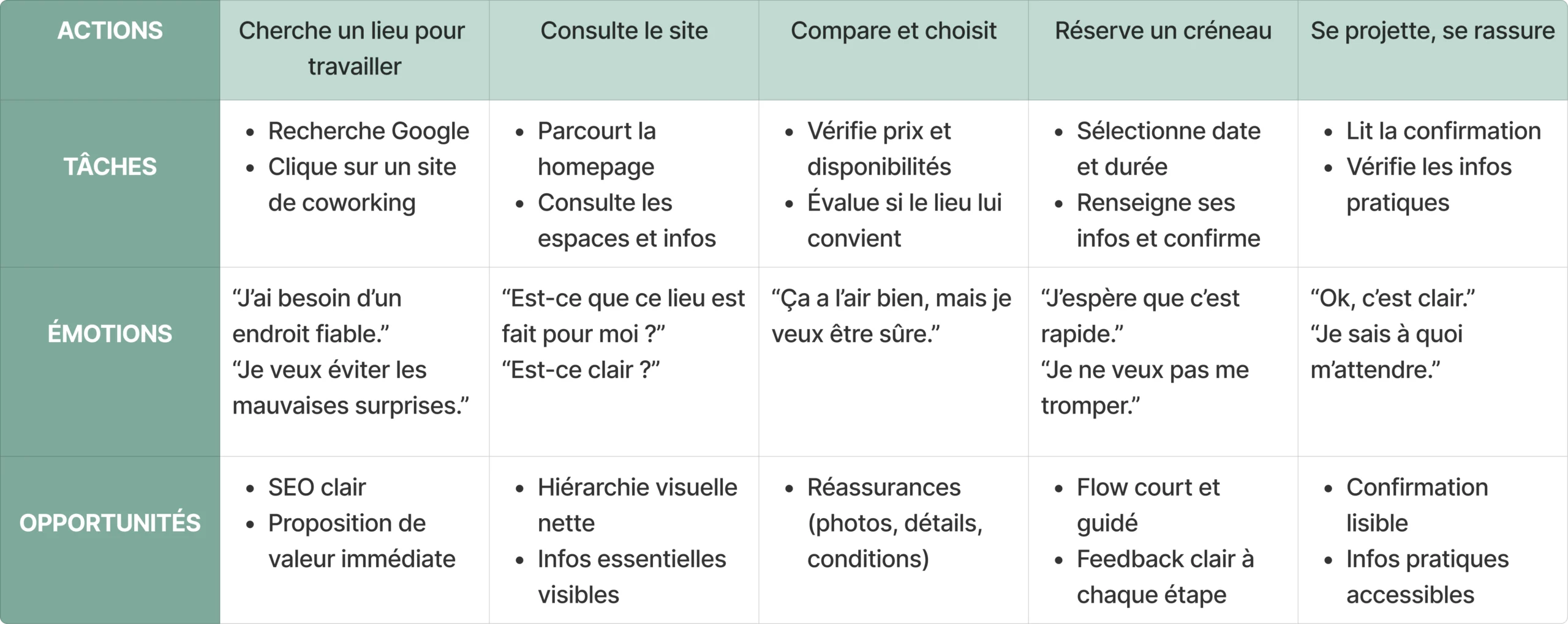
Based on all this data, I defined a persona and listed the opportunities or features that will help me stand out:
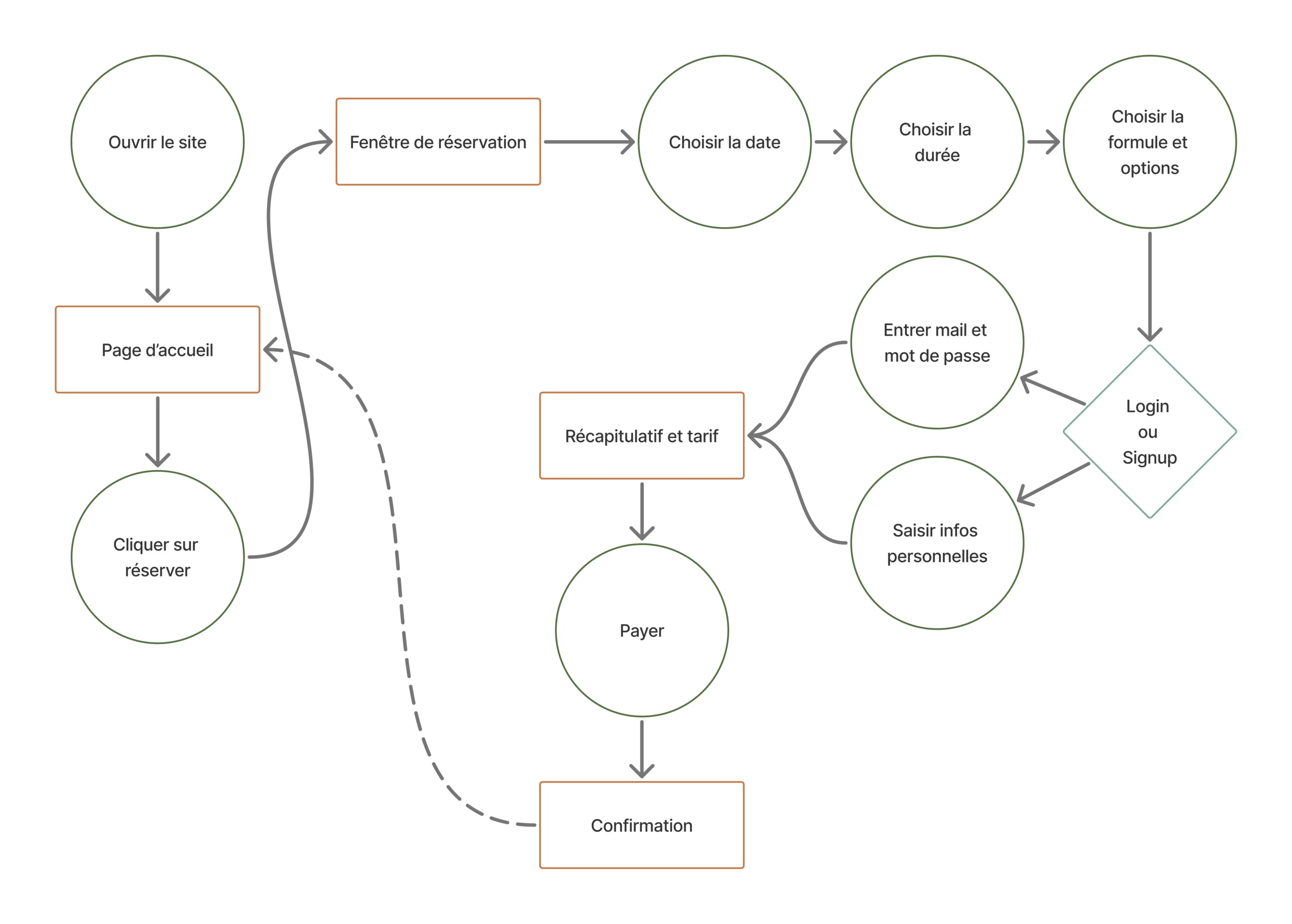
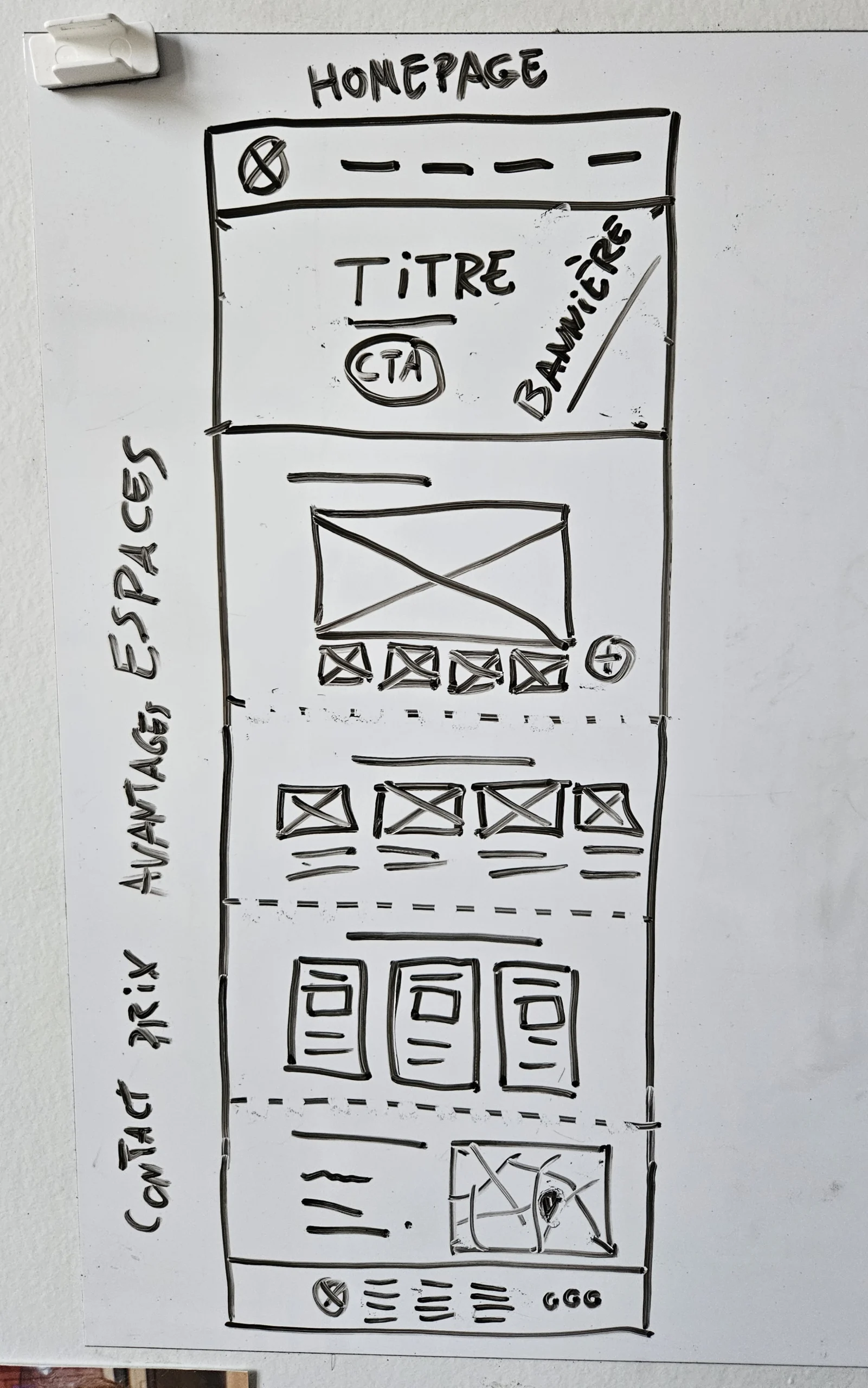
I developed my digital wireframe into a prototype to have it tested by a few friends. Their feedback highlighted the need to have access to the contact form directly on the home page, as well as a breadcrumb trail in the booking flow to provide an overview of the steps involved. I took note so that I could apply this on the mockup.
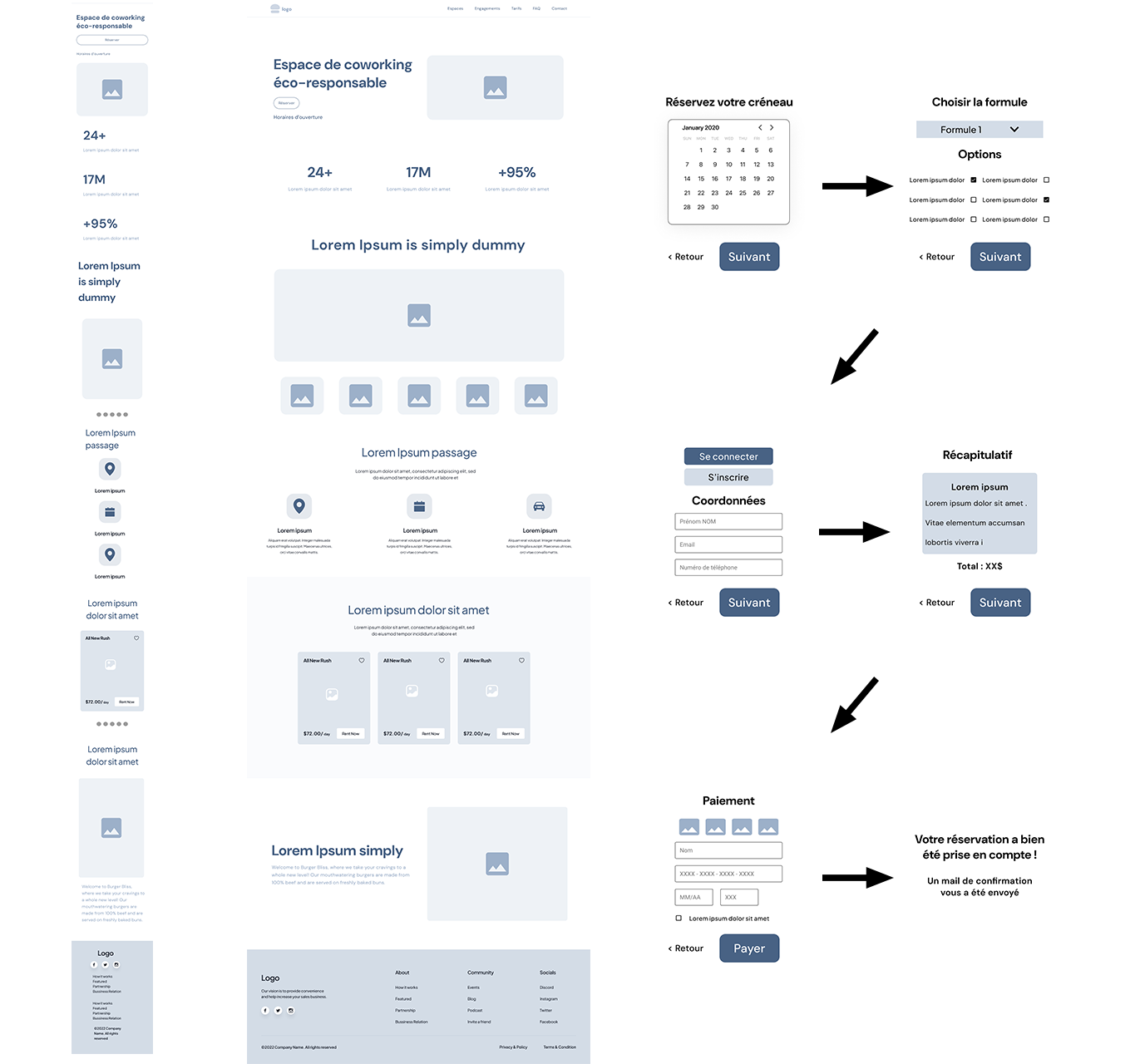
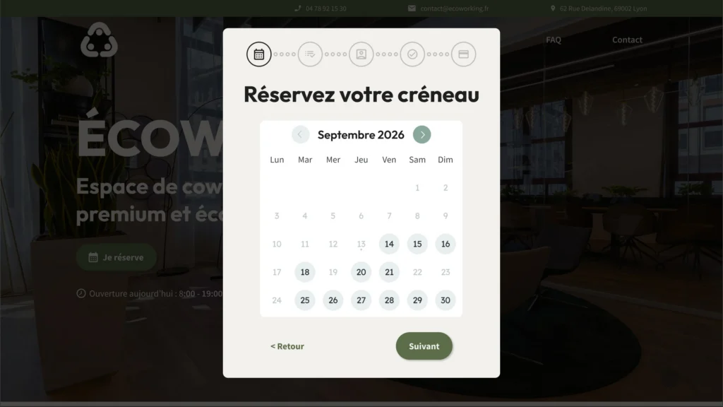
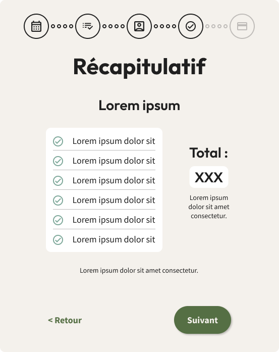
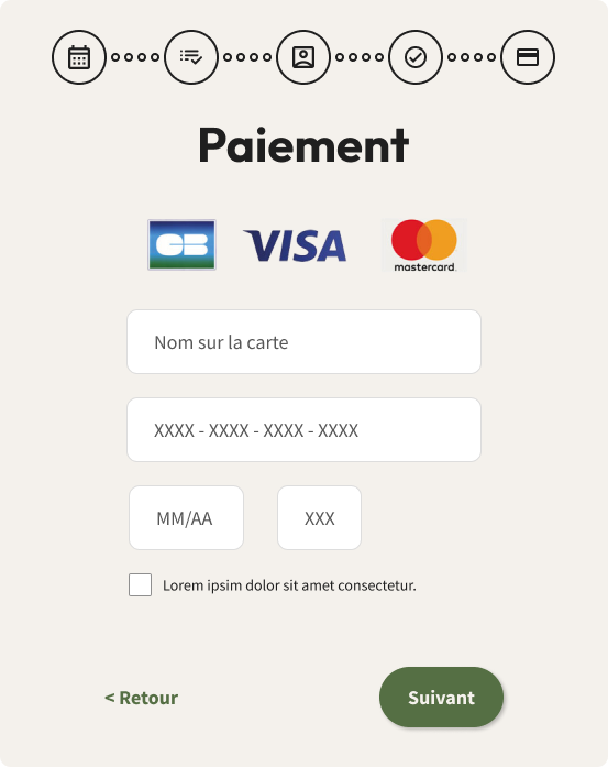
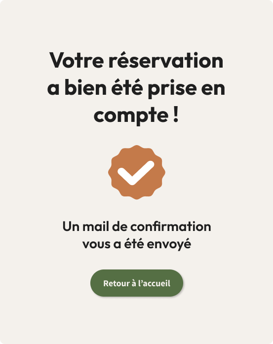
I designed a home page and booking flow optimised for conversion and meeting user needs:
Click to enlarge
📝 This exercise I set myself was 100% fictional, which means that the actual measurable impact on the business or usability is almost non-existent.
However, it enabled me to design part of a realistic website, based on the study of a real-life problem.
Saveurs de fêtes