


As part of my Web Designer training course (Activmedia), I created a website from scratch as my personal certification project, including design and integration, as well as 360° communication.
The fictional client is Train’eat, a start-up in the field of sport and nutrition, specialising in the sale of boxes containing fitness programmes, meal plans, supplements and accessories.
As a freelance web designer, I carried out this project using a waterfall approach. After defining the scope of the project with my client using a questionnaire and Specifications, I submitted a quote to estimate the cost, and then planned the tasks to be carried out.
Tools used: Google sheet, Google doc, ChatGPT
I conducted a competitive audit and SWOT analysis of two competing websites. Their strengths enable me to identify UX opportunities, and their weaknesses enable me to implement countermeasures.
I conducted a market analysis and desk research on the web and social media to extract user data and create profiles for my two typical users (personas).
Click to enlarge
I continued by drawing up a user journey map to put myself in the users' shoes and identify UX opportunities based on the pain points they might encounter.
Tools used: Google sheet, Google doc, Figjam, Google, ChatGPT
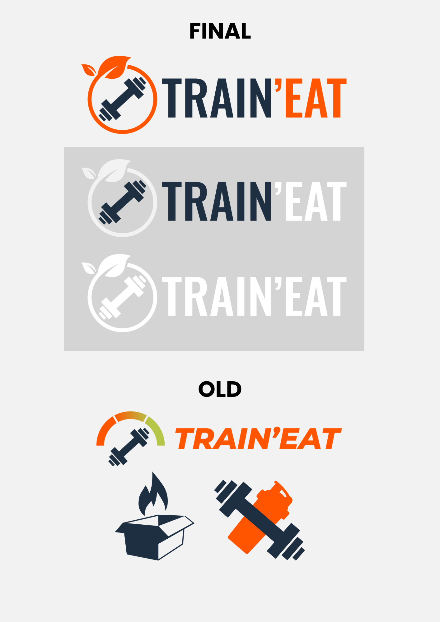
As this was not a redesign but a project built from scratch, I was tasked with creating the company's visual identity.
I began by putting together a mood board featuring a basic colour palette, typographical guidelines and inspirational images.
I then created the company logo, first on paper and then in Illustrator.
Tools used: Canva, Photoshop, Unsplash, Freepik Illustrator, Adobe color
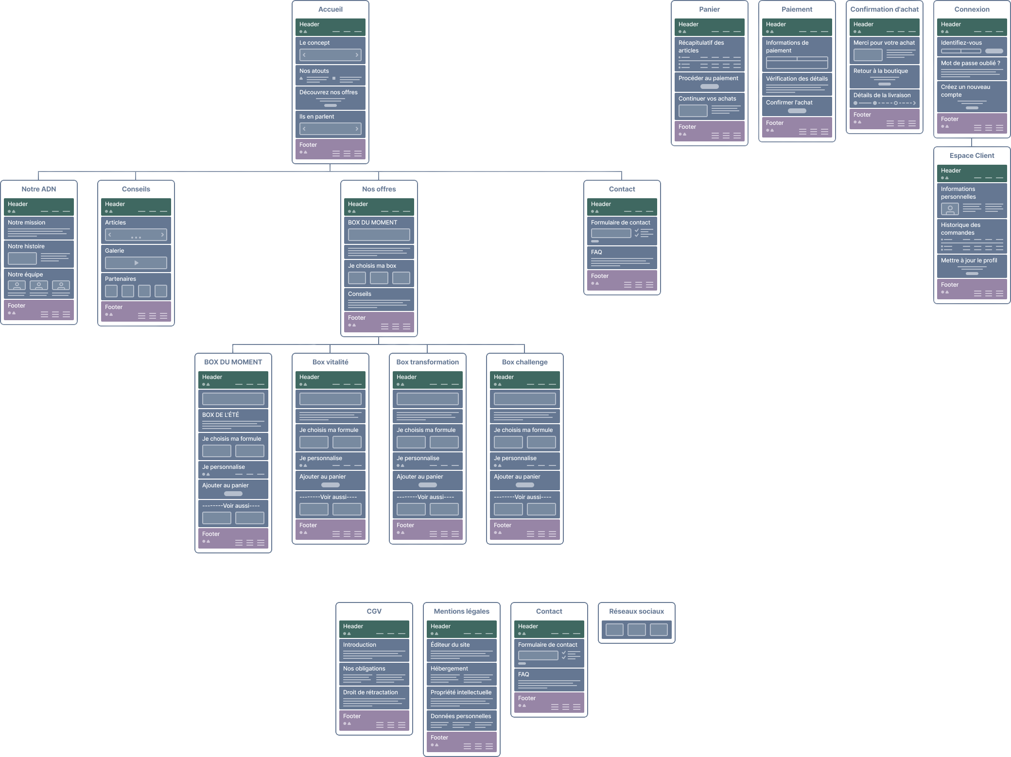
I organised the site content and navigation using a sitemap.
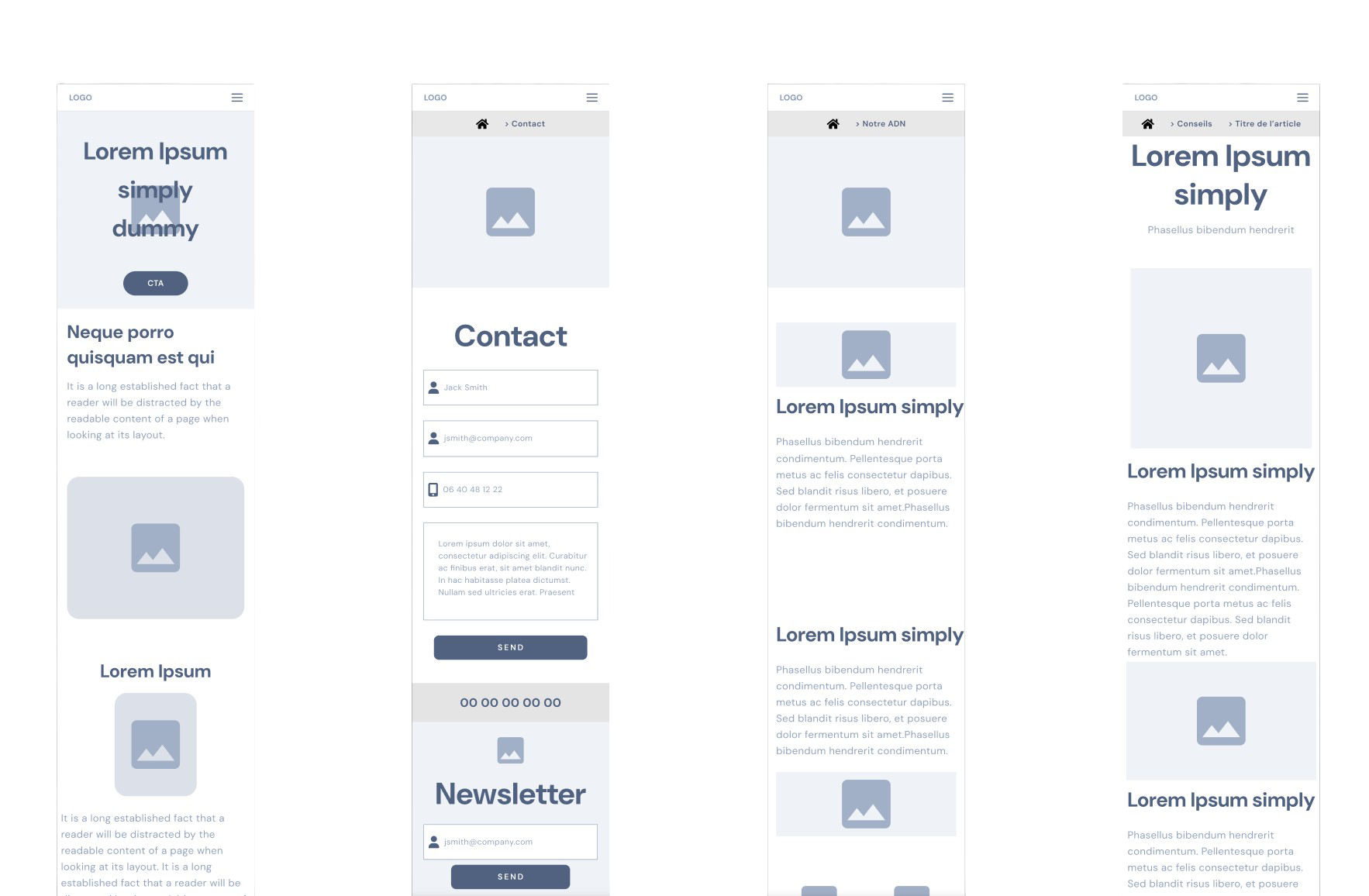
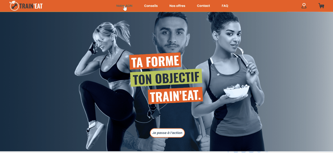
Next, I moved on to Figma for the wireframe. I used ready-made UI components to define the zoning of the site's standard pages.
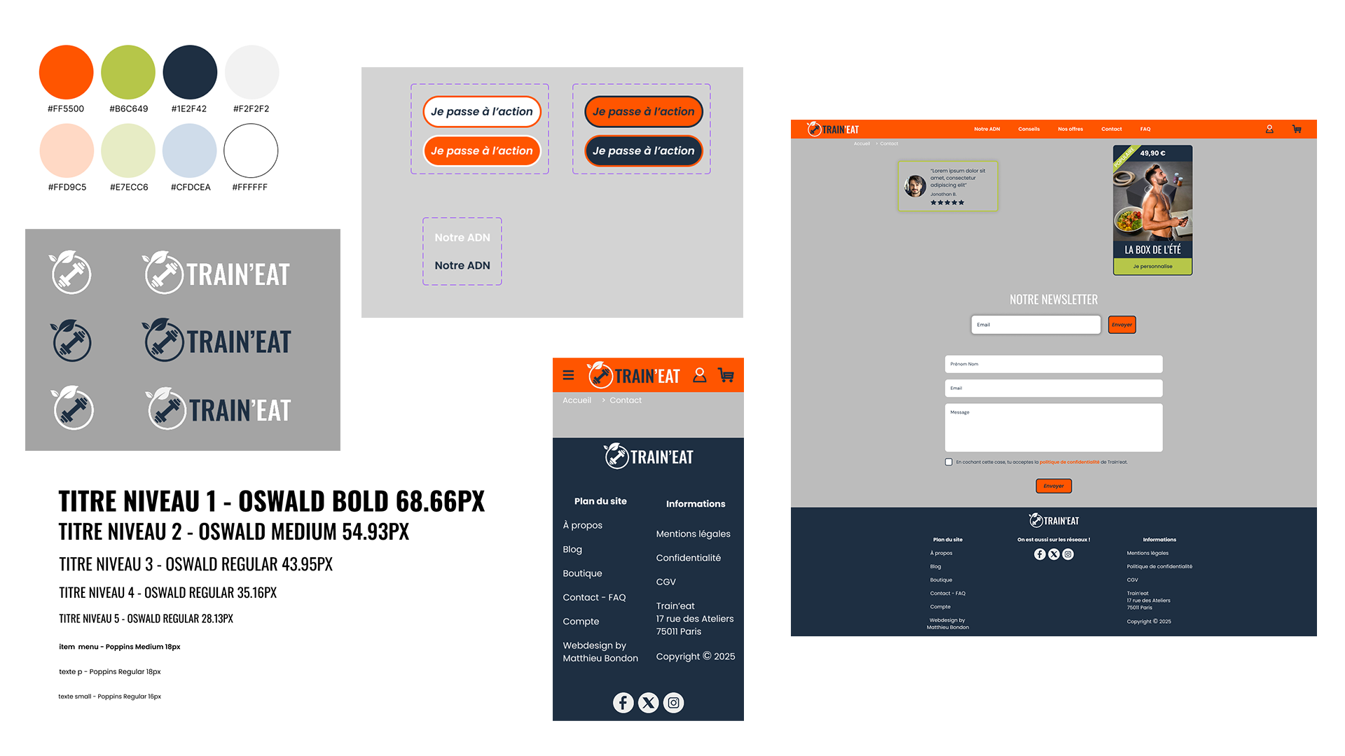
Still in Figma, I then moved on to the UI section, starting with my "design system" page:
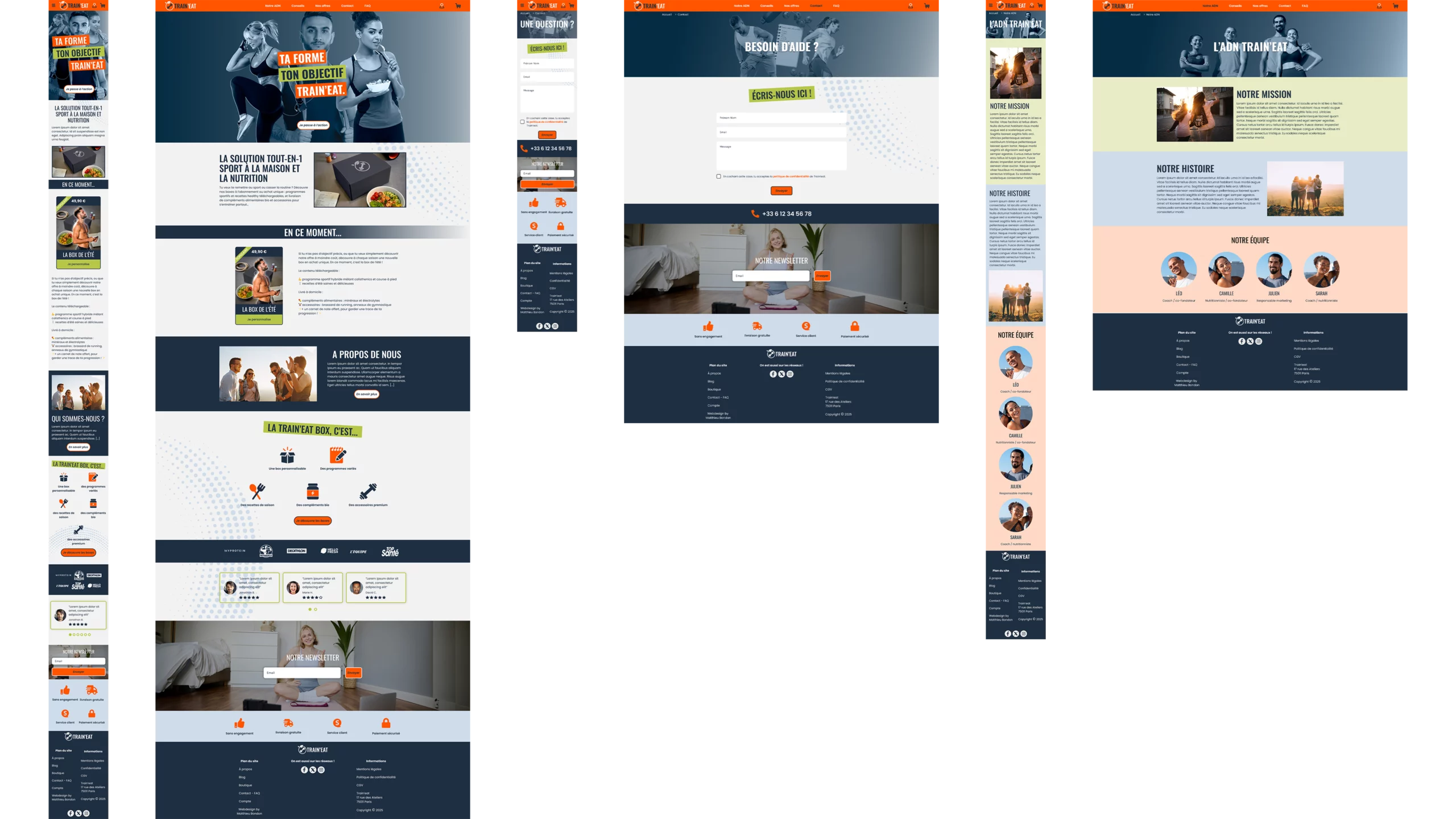
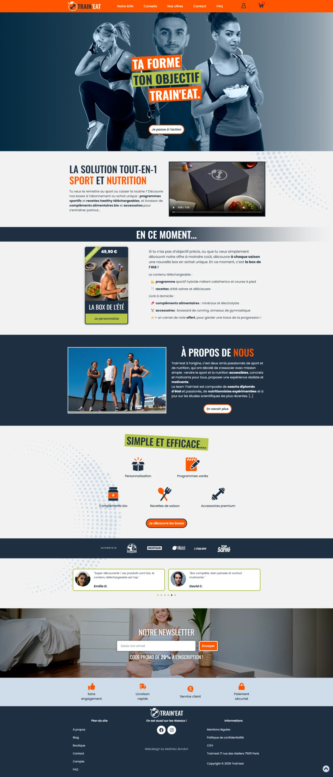
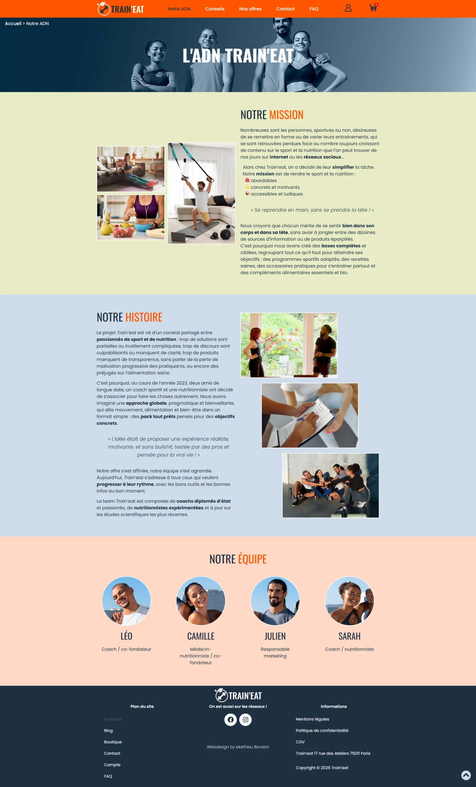
I then created a high-fidelity mock-up:
Tools used: Figma, Adobe Colors, Typescale, Google fonts, Unsplash, Freepik
The mock-up then evolved into an interactive prototype, with links between pages, hover interactions, and various animations.
Informal tests were carried out by myself and a few friends.
This was followed by a short iterative process of testing and modifications to the mock-up/prototype.
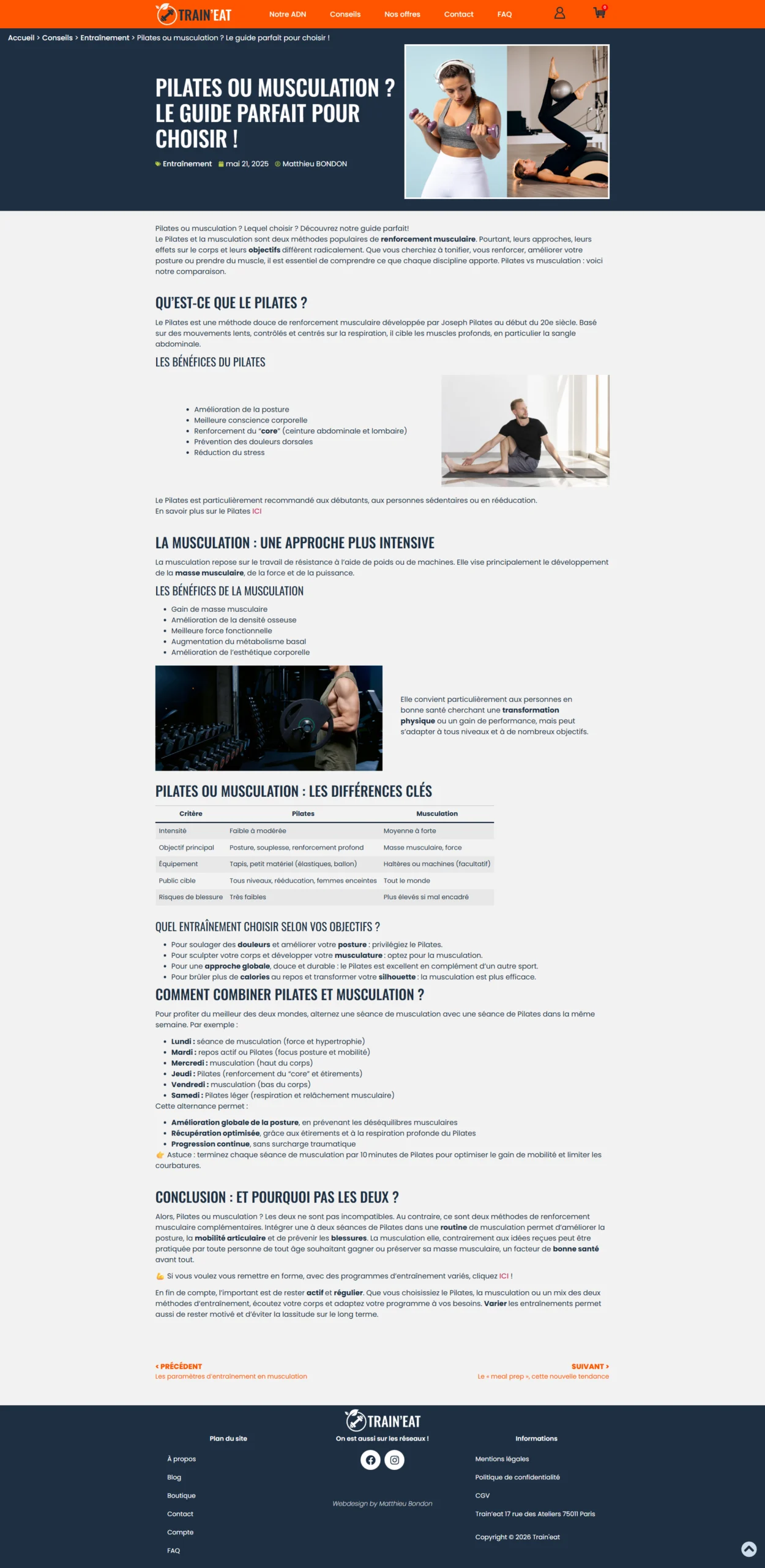
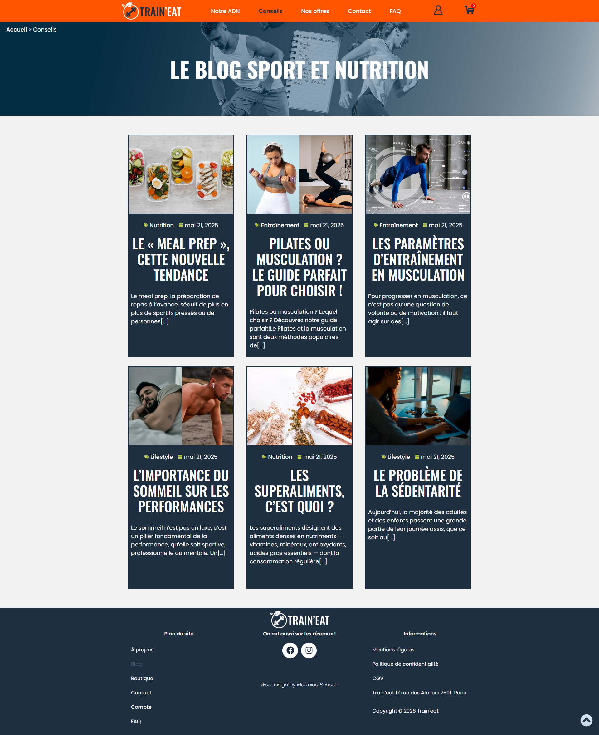
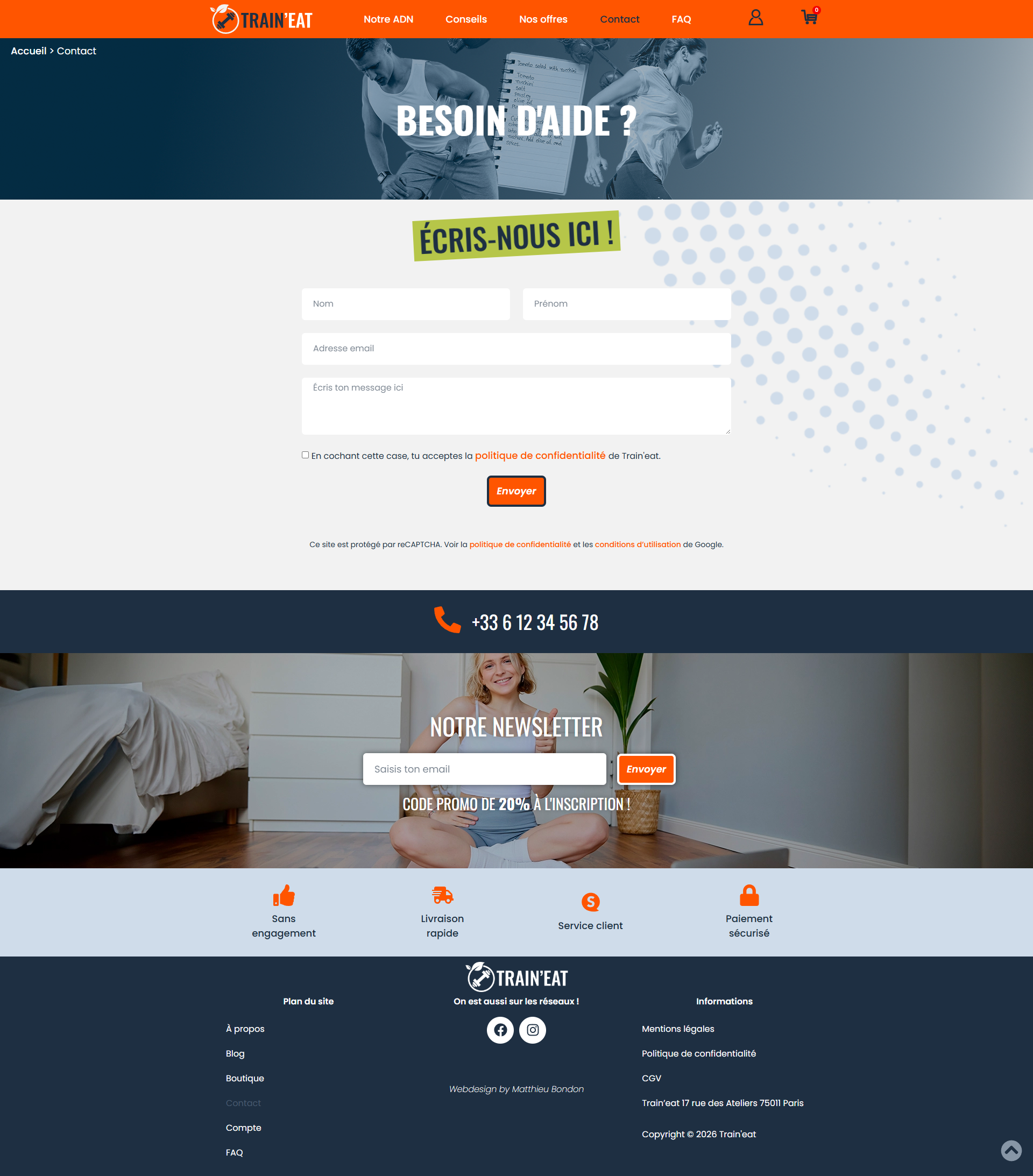
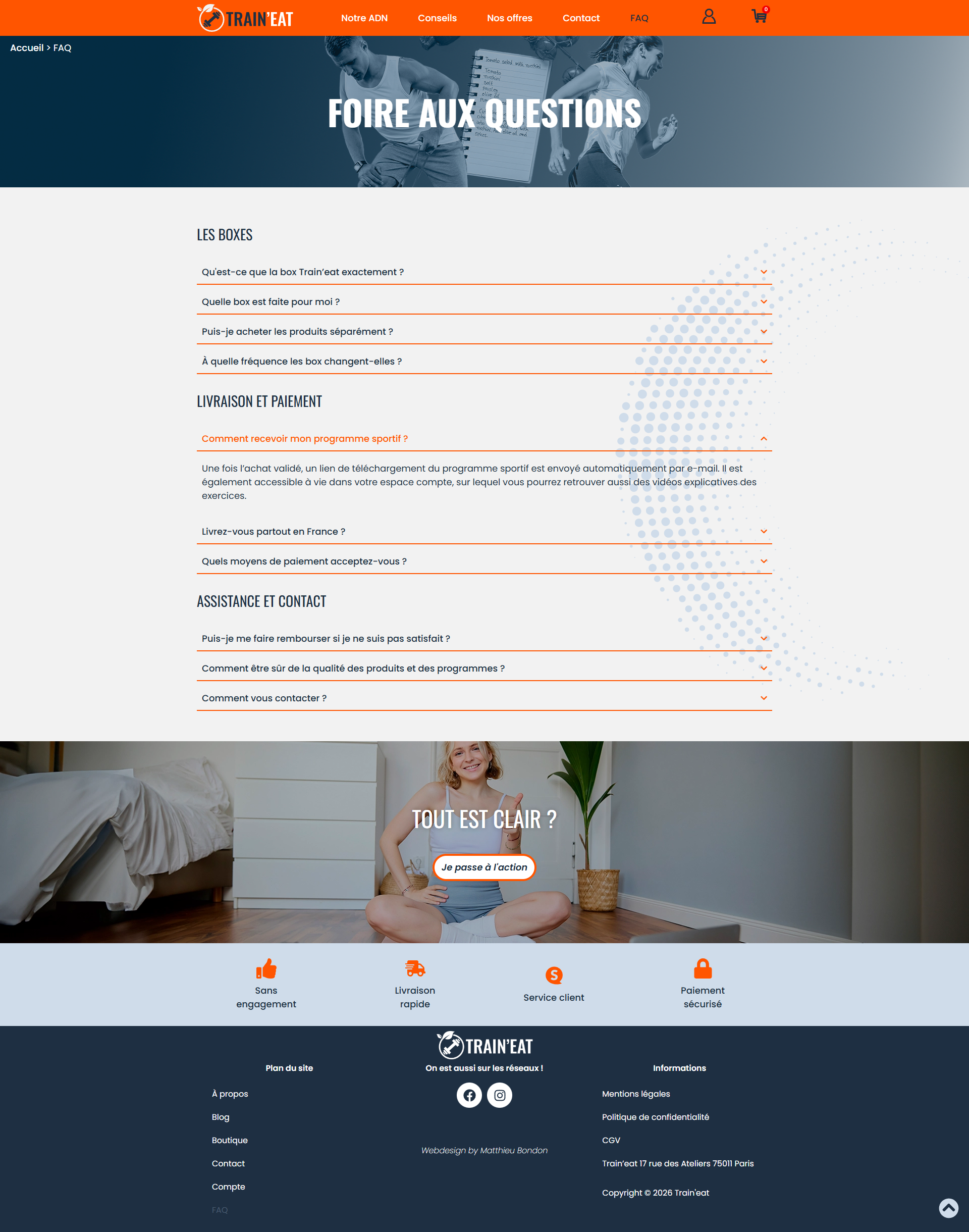
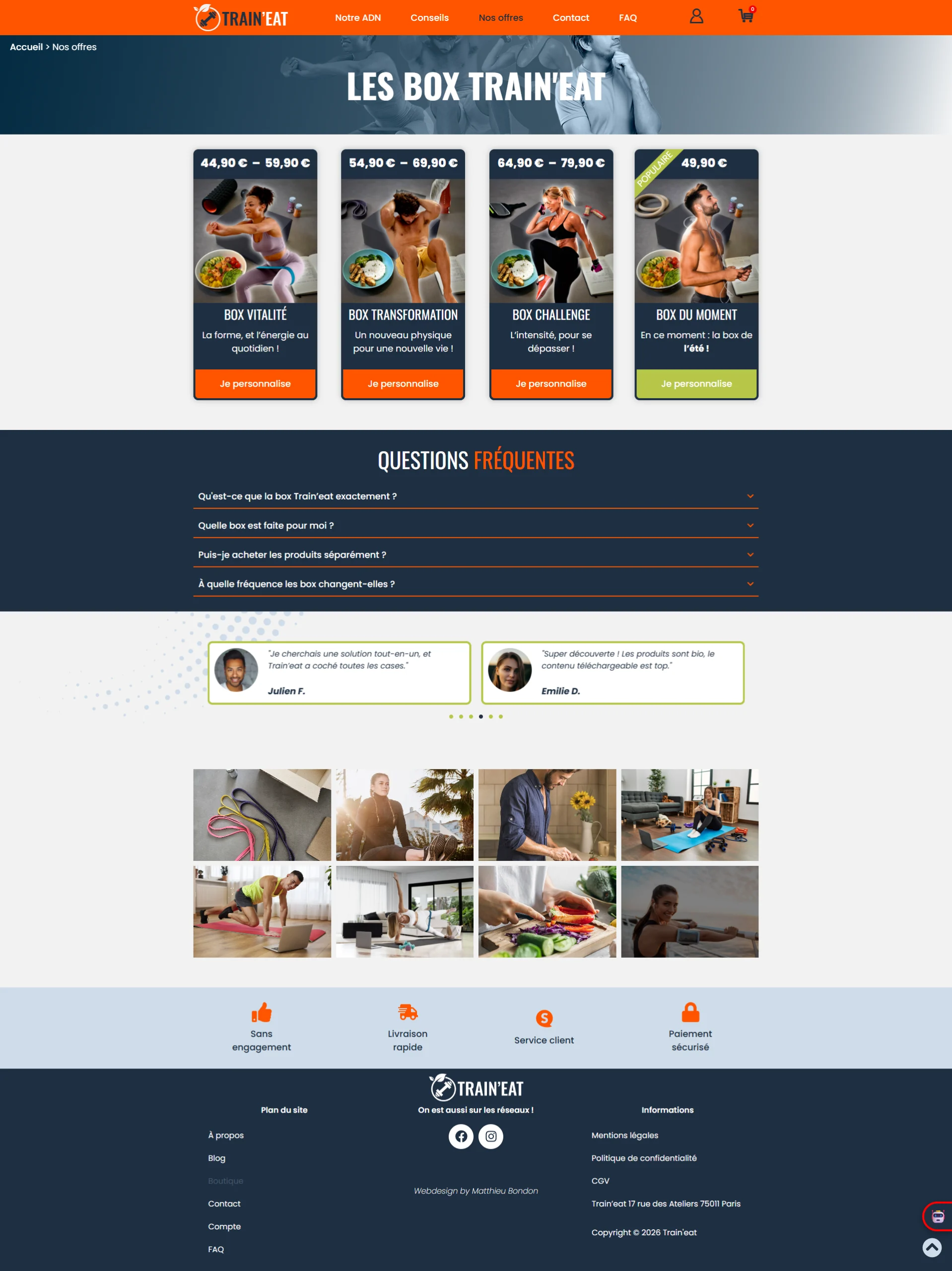
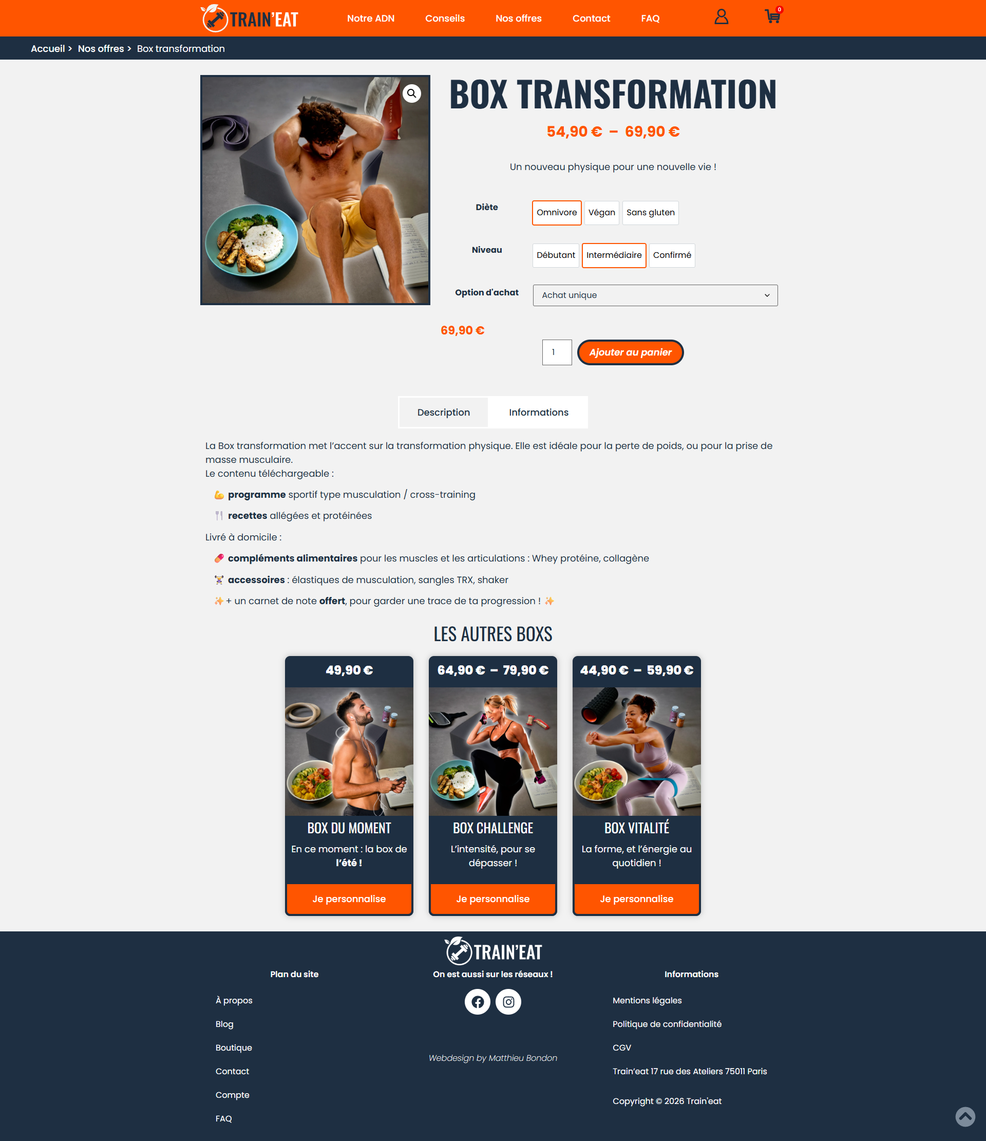
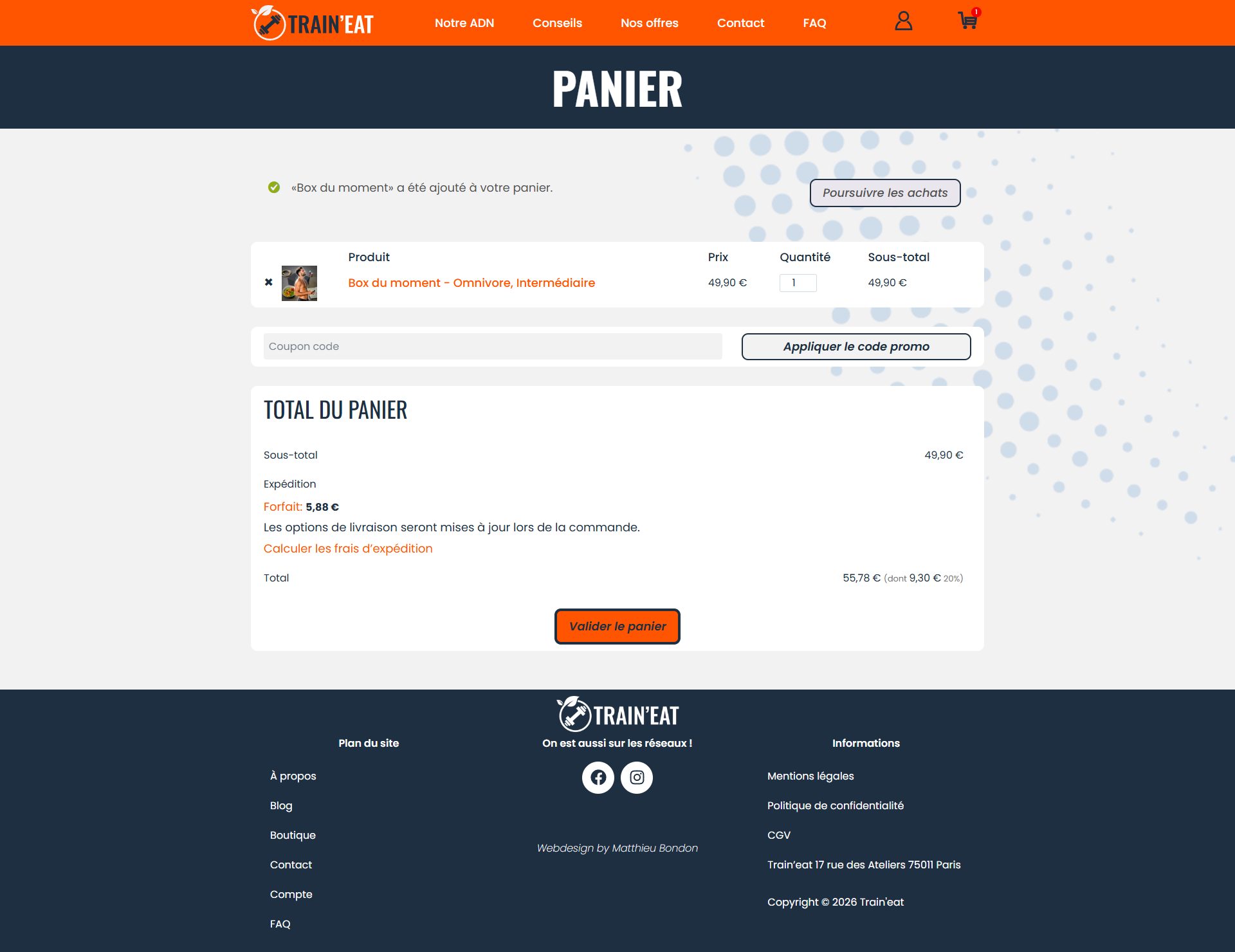
I finally switched to WordPress to integrate the actual website.
I configured the CMS, pages, menus, articles, and built the showcase part of the website, ensuring that it was always responsive. I used HTML/CSS and a little JavaScript to further customise it and implement certain features.
I installed and configured the Woocommerce plugin to build the e-commerce section of the site, with the shop, products, and sales funnel.
📝 The UX part was limited by the lack of in-depth user research and real-world testing. Furthermore, the "Waterfall" management imposed by the school is not the most suitable for a true iterative process.
👍 Nevertheless, this project was very educational. I am particularly pleased to have been able to create a website with a consistent design, smooth navigation, and an engaging graphic charter.
👁️ To view the final website built on WordPress, click the button below.
Génial Shop