Background and objectives
This project is a UI design challenge proposed by Cacatoès Academy.
Brief:
- Design a mobile cooking app for the festive season
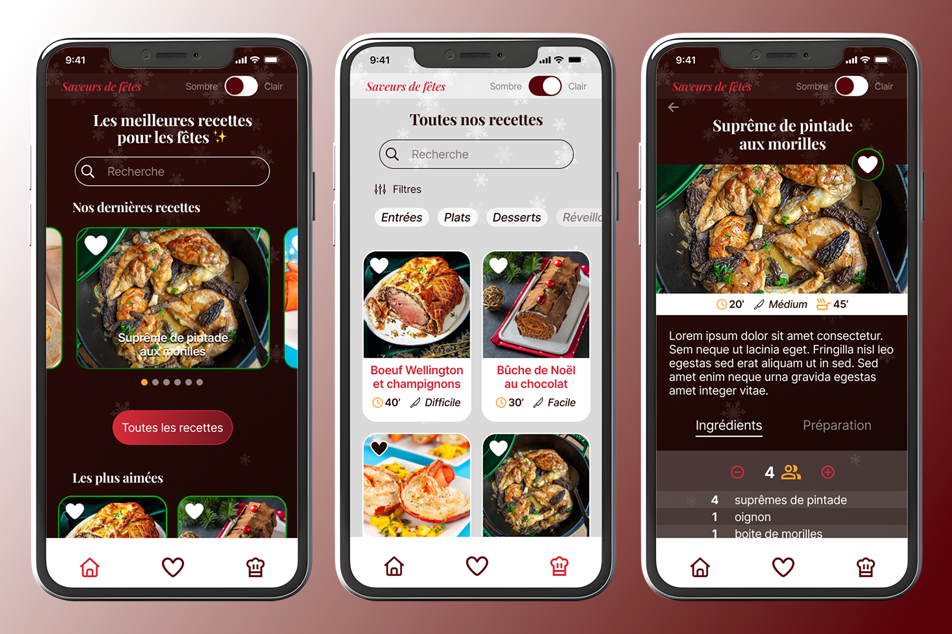
- Christmas-inspired colour palette, with the option to switch between festive and understated themes.
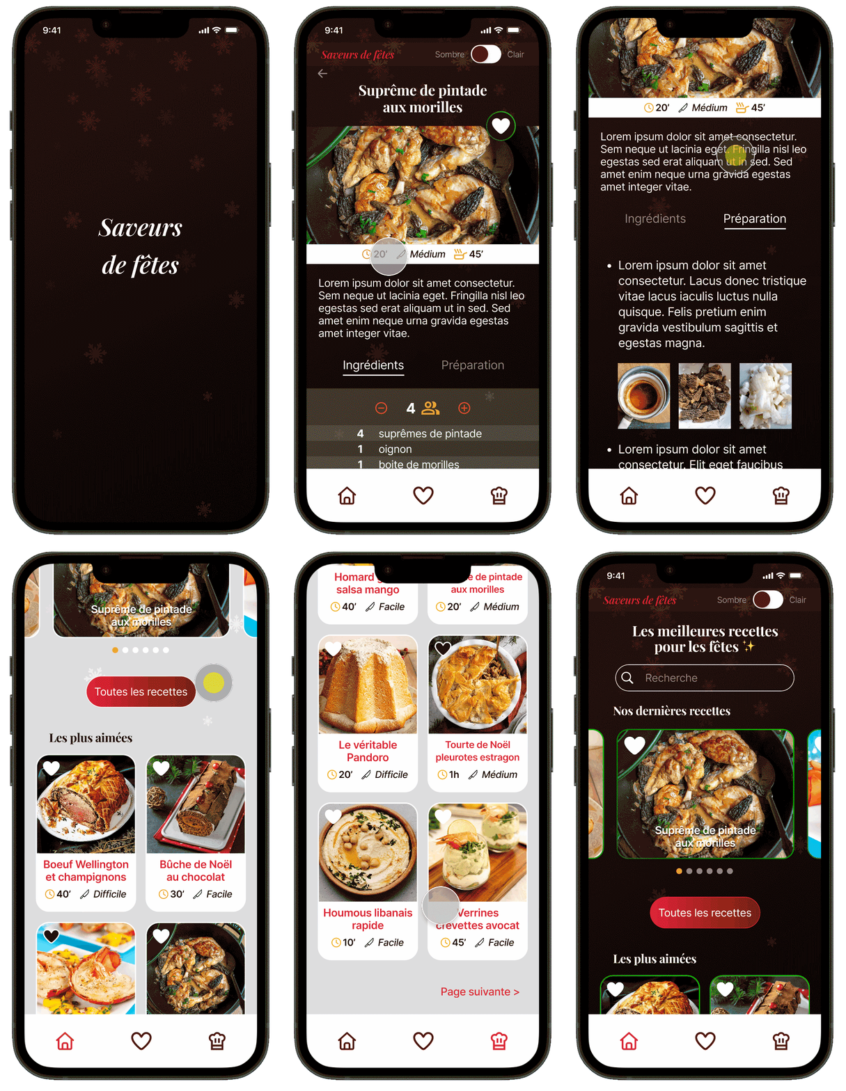
- Homepage, with search bar, latest and most popular recipes, a navigation bar
- Recipe list page, with filtering by category, and recipes displayed as cards
- Recipe page with information, description, ingredients (with serving size selector), and preparation steps
My goal was to challenge myself within a limited time frame (one week) by designing a realistic application with an attractive UI and a consistent user experience.
Research and ideation
Before diving into Figma, I took the time to conduct a benchmark to identify best practices in the industry and set myself apart from the competition. I audited two applications: Marmiton and Christmas recipes.
| Christmas Recipes | Marmiton | |
|---|---|---|
| Strengths 💪 | Conversion table "Like" button to add to favourites |
Filters and categories Good presentation of recipes |
| Weaknesses 👎 | Colour palette too plain, theme invisible No serving size selector No filters or categories |
Login required Unremarkable graphic charter Slightly confusing navigation |
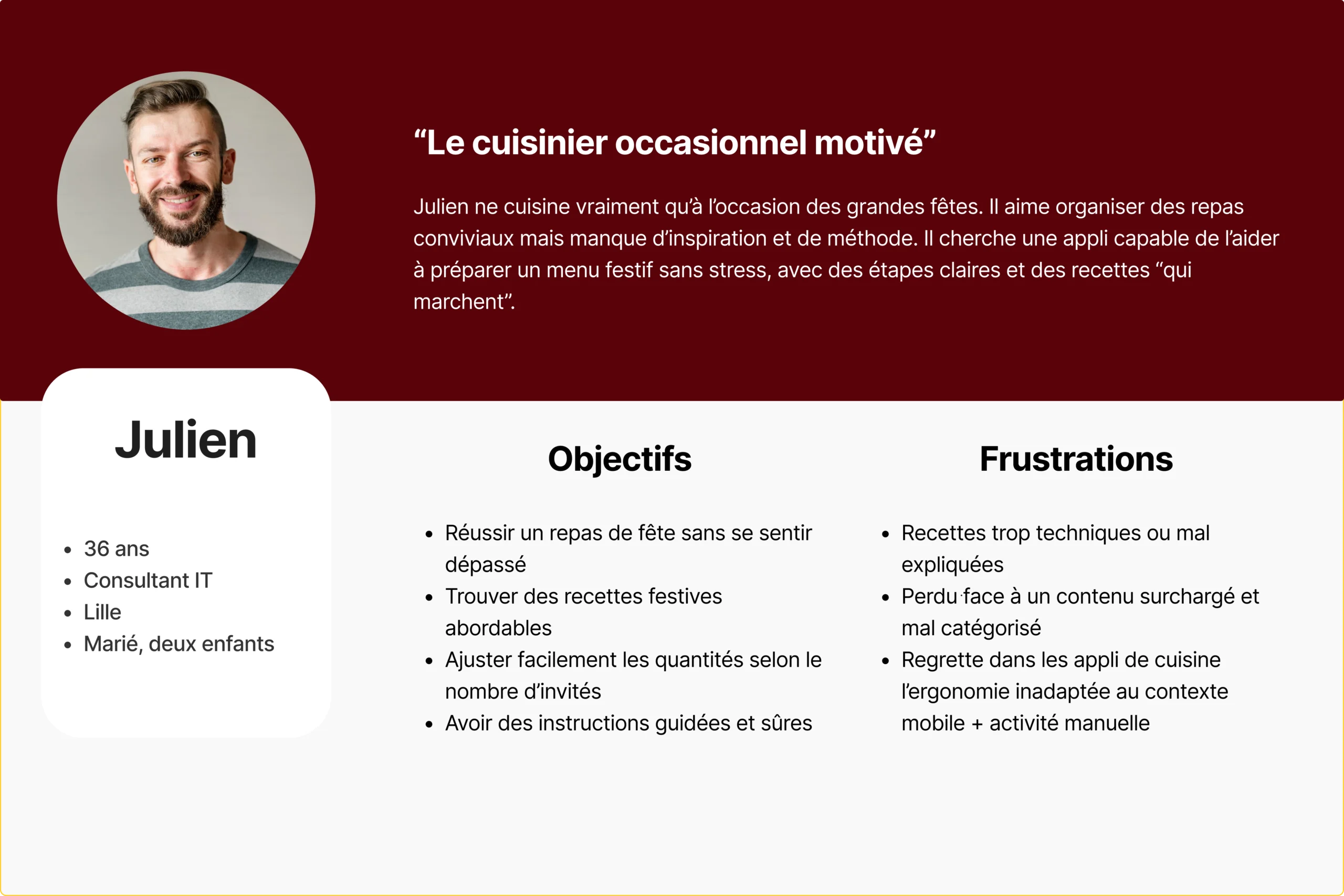
I searched (with the help of AI) for common pain points reported by users of this type of app, and defined a typical user (persona). I then listed the opportunities that would allow me to stand out and meet users' needs:
- Theme switcher with engaging graphic design
- Search bar and simple filters
- Dynamic selector for number of servings
- Favourites page (added via the like button)
- Intuitive navigation and streamlined content
- Visible and ergonomic CTAs
User flow & information architecture
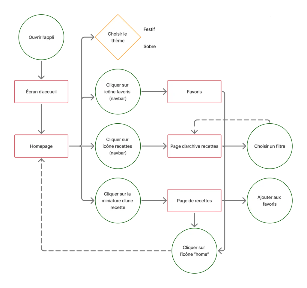
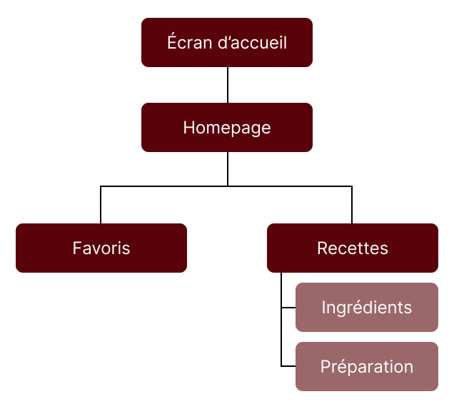
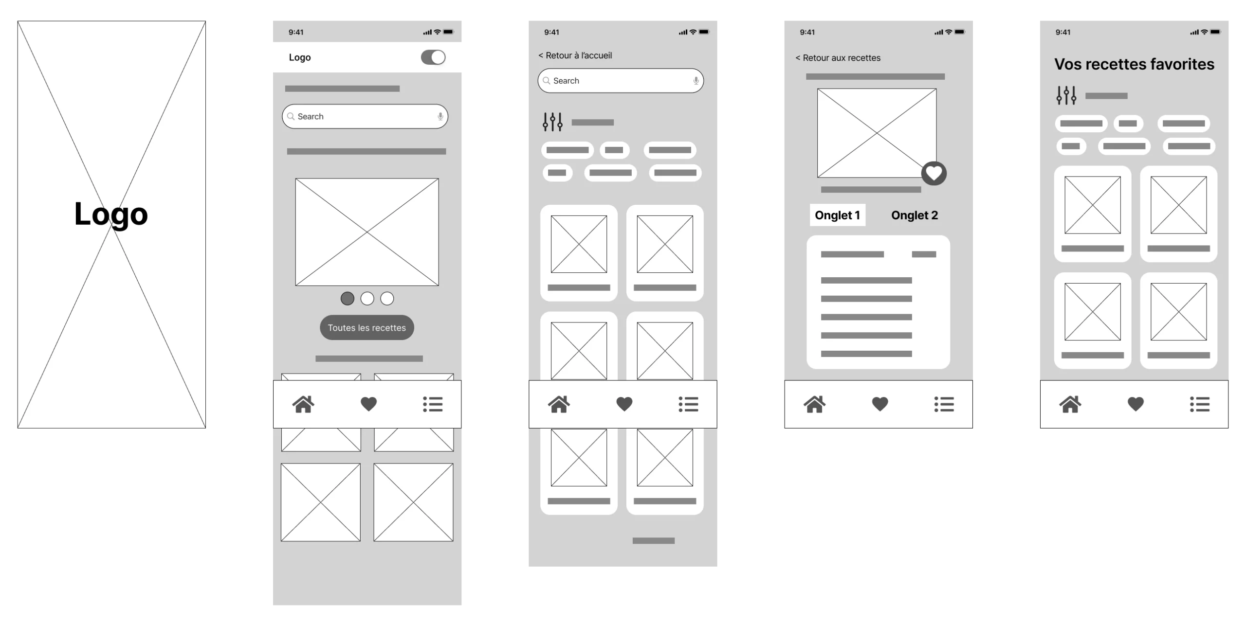
Wireframe
Final design
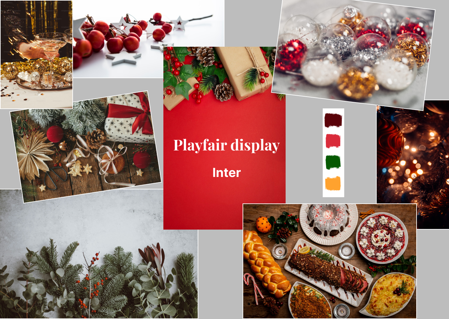
For the graphic part, I started by gathering some inspiring images on a mood board. I also defined my typographical choices and colour palette. Regarding the switch between festive and plain theme, I decided to focus more on a contrast between dark and light theme, based on a single palette.
Tools used: Figma, Unsplash, Freepik, Adobe Color
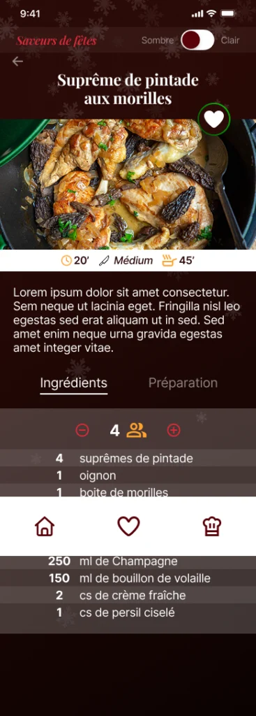
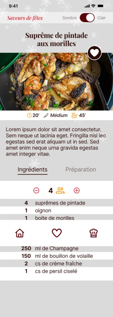
I finally designed the application's design system and high fidelity mock-up with a few interactions to test the navigation.
Dark theme
Light theme
Conclusion
📝 With this project, the focus was on the UI, leaving little room for UX research, testing, and iterations.
👍 Nevertheless, this time-limited challenge was very interesting because its constraints brought me closer to a professional context: quickly understanding a brief and an issue, prioritising and making coherent decisions.
Finally, I am pleased to have designed a smooth and aesthetically pleasing application mock-up.
Common!
