


As part of the Google UX Design certification, I carried out this design case study for a fictional mobile app. My role was that of UX/UI designer, from user research to high-fidelity prototyping, following the steps of Design Thinking. This is primarily an exercise designed to apply key UX design concepts throughout the learning process.
My choice of prompt (from a set list):
"Designing an app that helps friend or family groups manage a household budget and save up for a common goal (such as a vacation)."
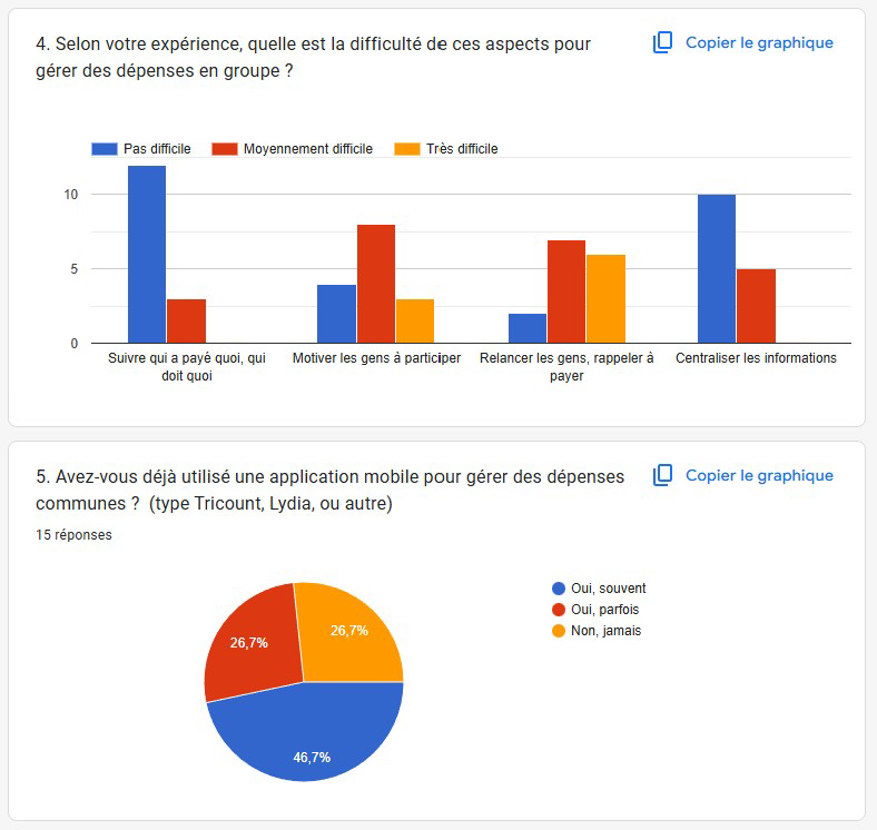
For the UX research phase, I chose the survey method combined with secondary research.
I submitted a number of questions to a diverse sample of people in my circle to gather quantitative and qualitative data.
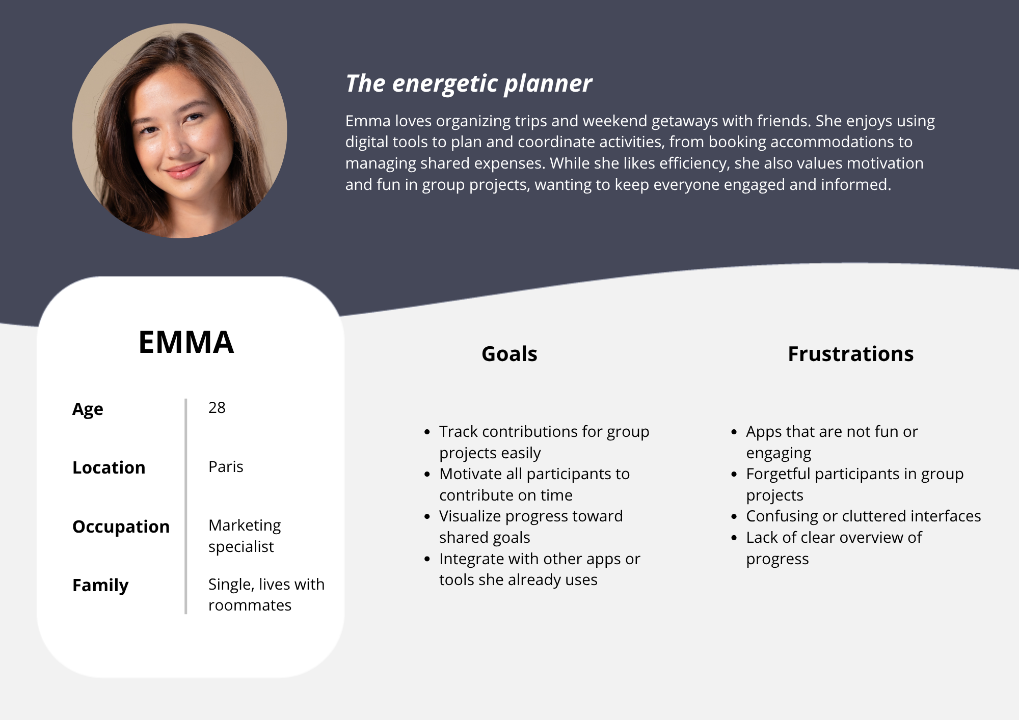
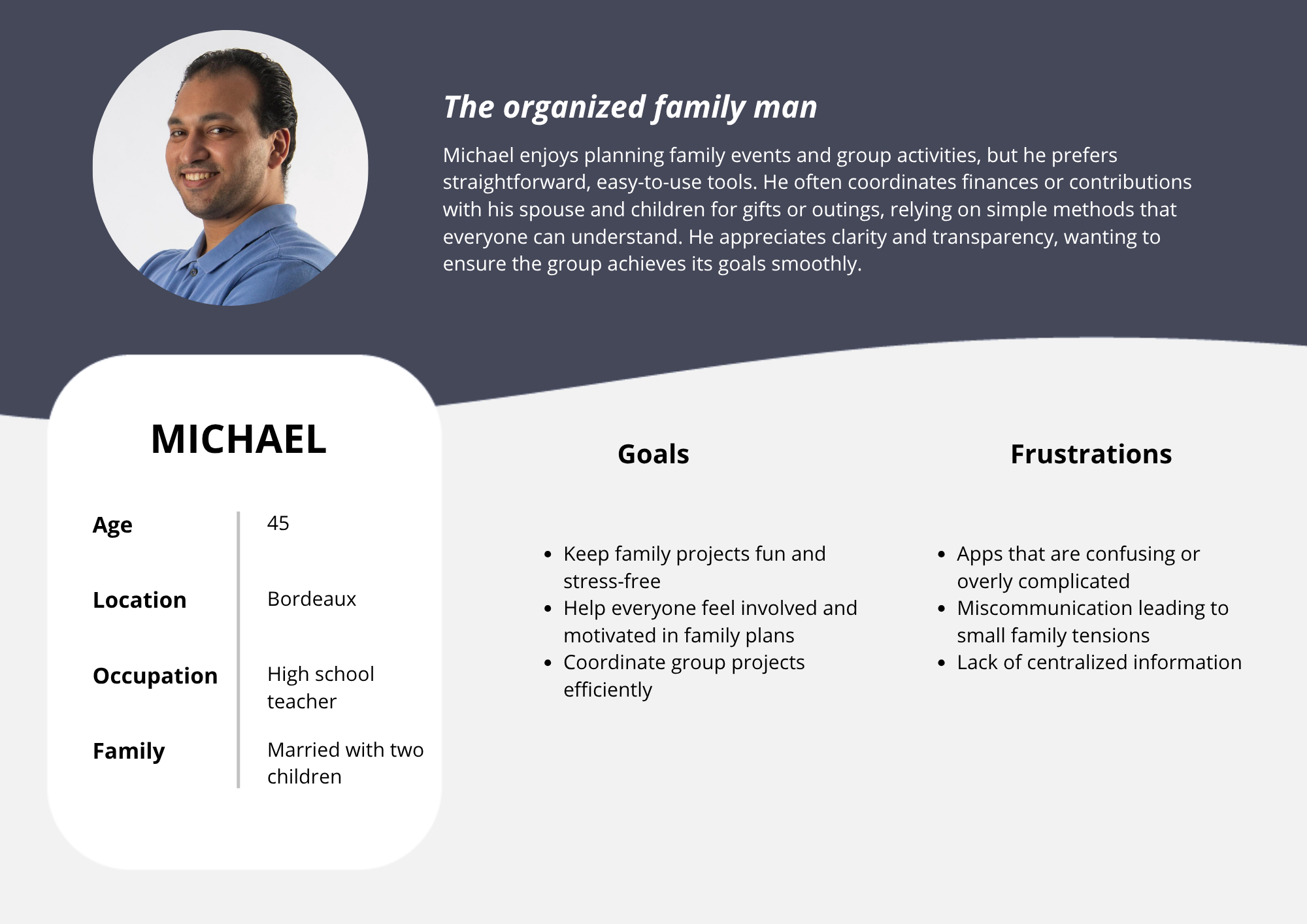
With these results, I was able to categorise my users into two distinct groups, on which I would base my personas:
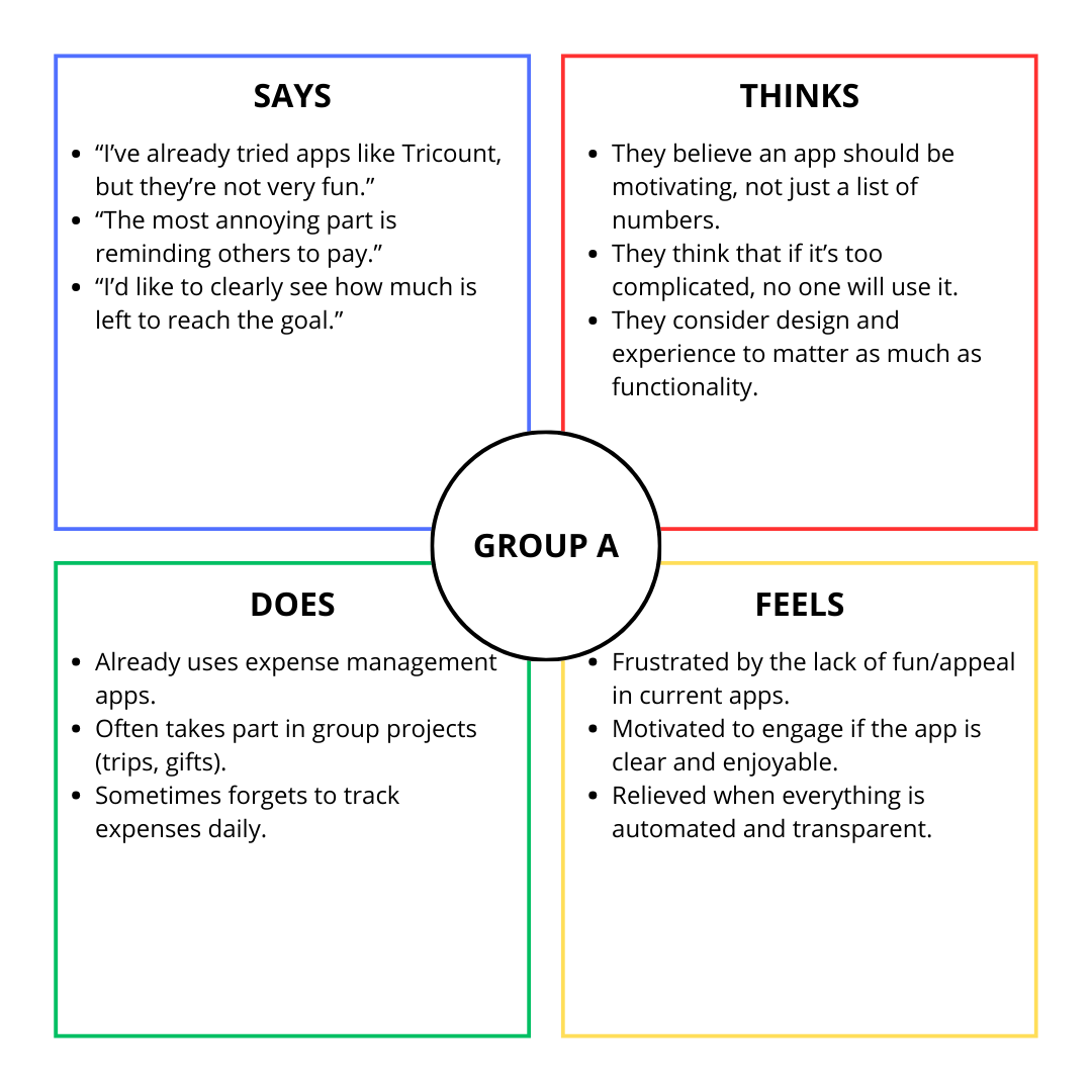
Group A
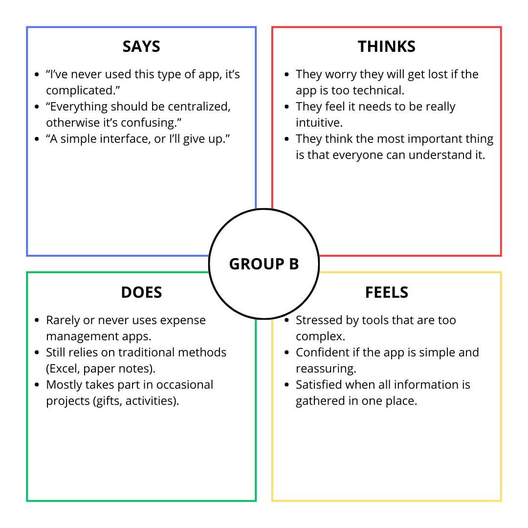
Group B
Still in the Empathy phase of Design Thinking, I created two persona sheets based on the data obtained from research and with the help of generative AI.
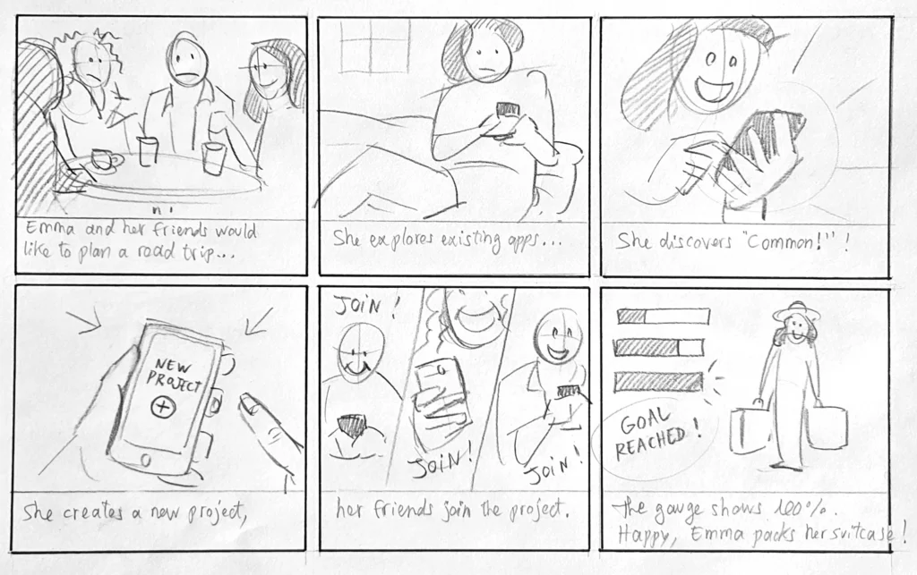
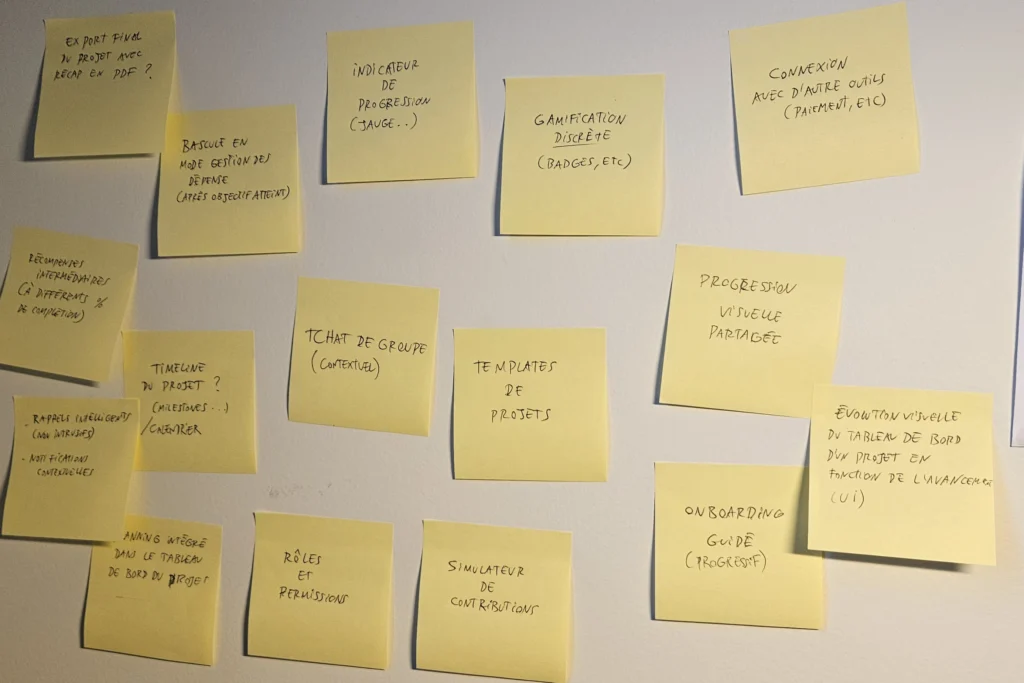
I began the ideation phase by creating a storyboard to put myself back in a position of empathy with the user, then I started writing down ideas, value propositions.
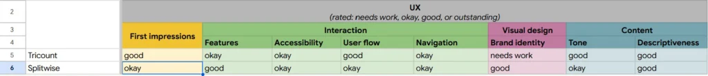
I conducted an audit of two indirect competitors, the Tricount and Splitwise apps, to identify their strengths and weaknesses and extract opportunities from them.
| Tricount | Splitwise | |
|---|---|---|
| Strengths | Optional login Onboarding on homepage Quite intuitive |
Skippable onboarding Groups by type (travel, housing, etc.) |
| Weaknesses | Few features, very simple | Login required upon opening Lack of transparency regarding expenses Freemium model |
Forces :
Faiblesses :
Forces :
Faiblesses :
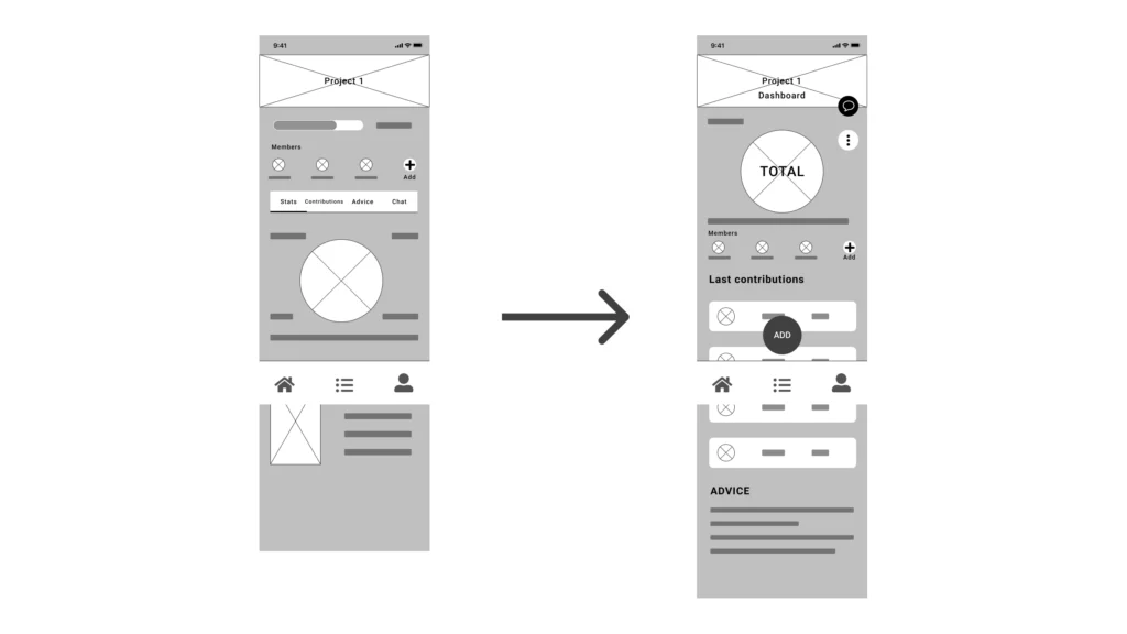
I then created a user flow to define the user's journey through the application...
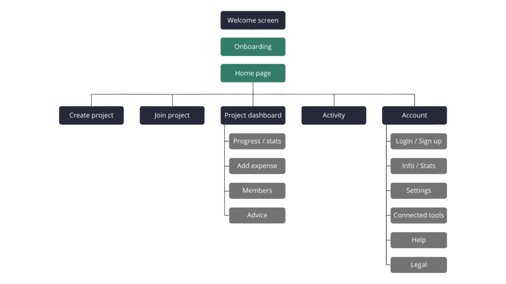
…then a sitemap to organise and prioritise the content.
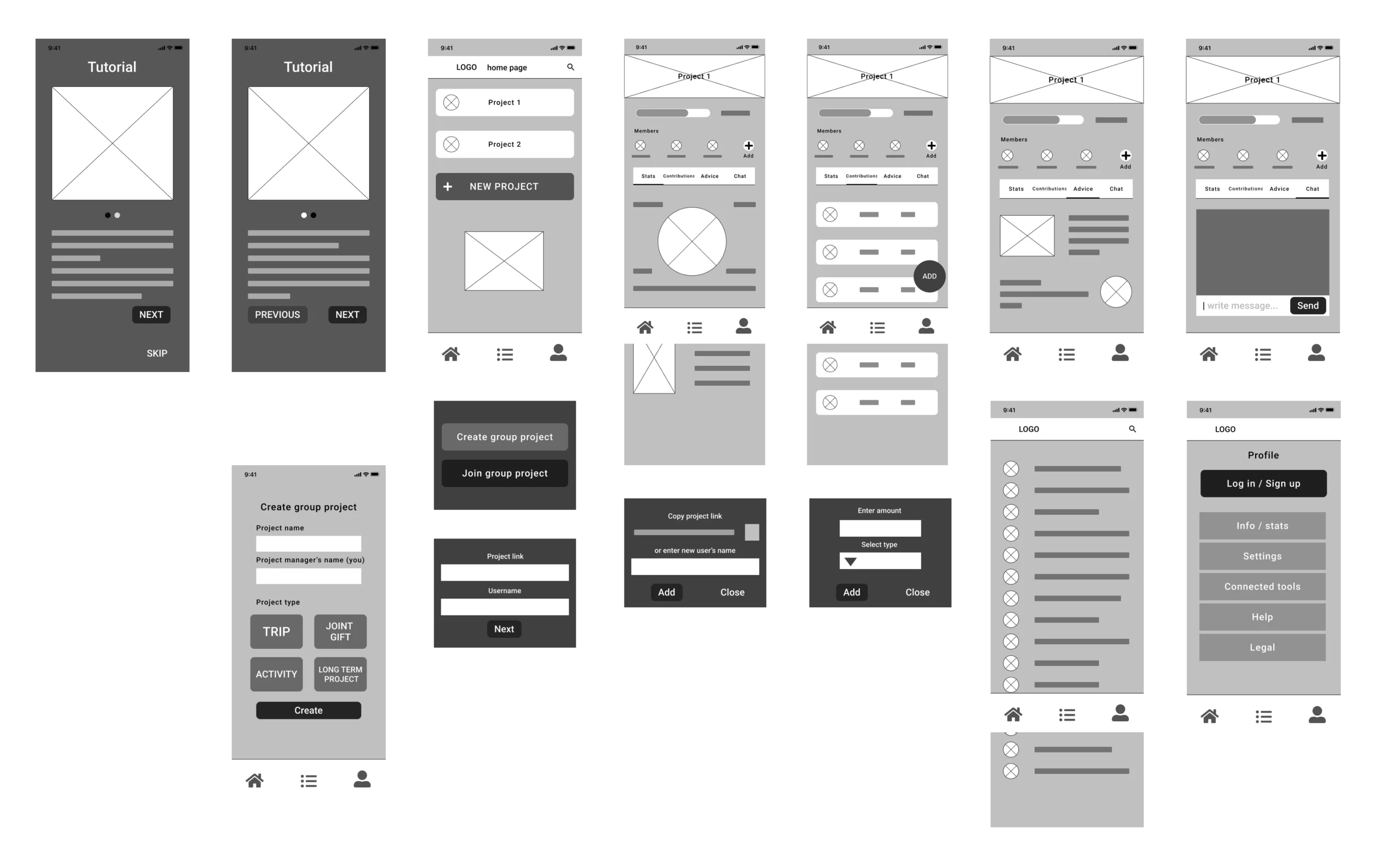
I created a wireframe of the main flow pages of the app, initially by hand to make it easier to iterate and start roughing out the zoning. Then I switched to Figma to create the digital version, which then evolved into a low-fidelity prototype.
In a user-centred design approach, testing the low-fidelity prototype is important because it allows participants to give honest feedback and designers to iterate while setting aside their biases.
I therefore put together a UX research plan to define the objective of the user test, the questions we wanted to answer, the KPIs to measure, the methodology, the sample of participants (in this case, a few friends and family members), and the script of tasks to be performed.
After the test, I was able to draw conclusions to iterate on my prototype.
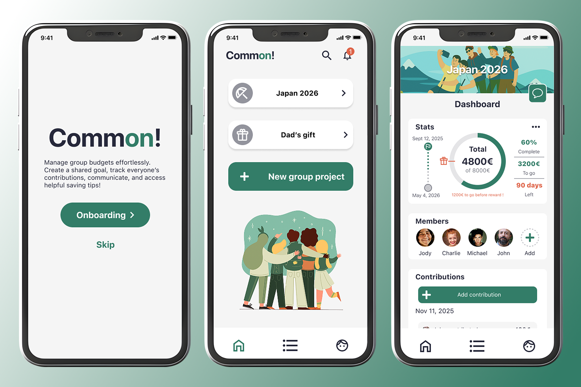
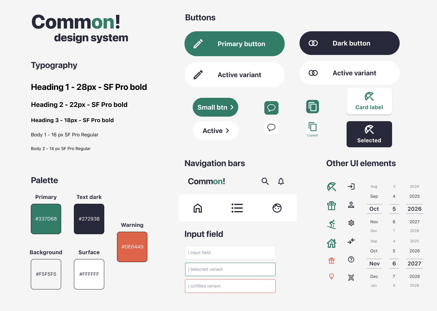
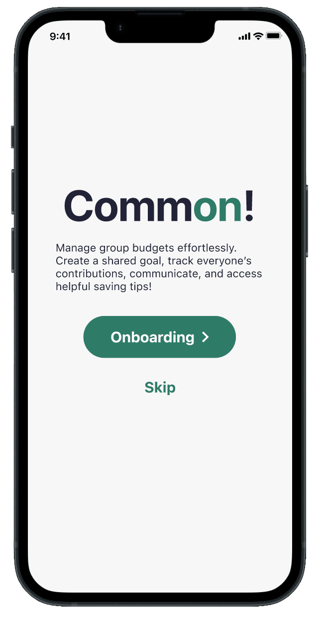
I finally created the application's design system, the mock-up, then the interactions and navigation to make a high-fidelity prototype.
📝 Due to the fictional nature of this project and the resources at my disposal, I was forced to validate my UX choices with limited data, no real measurable KPIs, and a reduced testing cycle...
👍 Despite this, I was able to deepen my knowledge of UX/UI, apply new methodologies, and create a product with a clear architecture, a smooth user experience, and a consistent design.
Train’eat